Nocturnal Animals: The Waking Dreams of Leon Spilliaert


Léon Spilliaert,Woman at the Shoreline, 1910

Léon Spilliaert,Woman at the Shoreline, 1910

‘I am no good at interpreting other people’s dreams; I have too many of my own.’
Leon Spilliaert

I recently visited a fine exhibition of the art of Leon Spilliaert (The Royal Academy, London - now closed but you can still go on a virtual tour).

Spilliaert was born in 1881 in Ostend on the Belgian coast. He grew up above the family perfume shop, a sickly, reclusive child obsessed with drawing. At 18 he enrolled at the Academy of Fine Arts in Bruges, but, after just a few months, ill health forced him to abandon his studies. He worked as an illustrator for a Brussels publisher and spent some time in Paris. However, he soon returned to Ostend where he felt more at home.

‘My head seems to be sort of filled with mists.’

Spilliaert was frustrated by his lack of recognition. He suffered chronic stomach ache and insomnia. He endeavoured to cope by taking long twilit walks through the empty streets of Ostend. He wandered down gloomy Hofstraat, past the Royal Galleries, to the wide-beached seafront. He watched the fog rolling in over the deserted promenade; the clouds looming over lonely beach huts.

'The darker the night, the brighter the stars,
The deeper the grief, the closer is God!'
Fyodor Dostoevsky, 'Crime and Punishment’

Léon Spilliaert, Hofstraat, Ostend, 1908

Léon Spilliaert, Hofstraat, Ostend, 1908

In infinite shades of grey, with just the occasional dash of colour, Spilliaert created images of the solitary signal pole at the end of the pier, the desolate breakwater looking out onto the North Sea. In Indian ink, watercolour, pastel and charcoal, he painted the lighthouse in a storm; the Royal Palace Hotel haunting the far-off skyline. He depicted slender trees reaching for the nightsky, moonlight falling on the mountaintop, the cemetery at dusk. 

'The mind is its own place, and in itself can make a heaven of hell, a hell of heaven.'
John Milton, ‘Paradise Lost’

There’s a man hailing someone in the distance, a lady in a wide-brimmed hat with her back to us on the shoreline. There are young women paddling in the shallows; long robed women waiting - by the clock, by the window, on the jetty. A girl, caught in a gust of wind, holds on for dear life.

Spilliaert paints his bedroom - empty and unadorned. In his glass-roofed studio, amongst the pot plants, he studies his blue sketchbook; scrutinizes his drawing board. He examines himself in the mirror: smartly attired, but with dishevelled hair standing upright in an alarming quiff. There are dark rings around his eyes. 

'Night is the other half of life, and the better half.’
Goethe

Léon Spilliaert, Self-portrait, 3 November, 1908.

Léon Spilliaert, Self-portrait, 3 November, 1908.

Spilliaert was an artist of unease and melancholy, of solitude and silence. He recognised that the night is a time for reflection - when, liberated from the urgent bustle of the day, a settled peace descends, and the world looks and feels different; when profound truths reveal themselves. At night we stand on the threshold between rationality and fantasy, between dreams and reality. It is a time for invention and resolution.

'I love the silent hour of night,
For blissful dreams may then arise,
Revealing to my charmed sight
What may not bless my waking eyes.'
Anne Brontë, ‘Night’

We should all respect and value ‘the wee small hours of the morning.’  We should treasure their creative potential. At night the mind is free to explore untravelled paths, to make uncommon connections. We can come to terms with the problems that we can’t quite solve in the light.

'Whoever thinks of going to bed before twelve o'clock is a scoundrel.'
Samuel Johnson

I confess I have for the most part been early to bed and a sound sleeper. I have been robustly conformist. Nonetheless, I have always kept a pen and paper by my bed, so that I can record the random thoughts and recollections that sometimes interrupt my slumber. In the morning I have discovered both lateral insights and meaningless drivel. 

The difficulty is telling one from the other.

'Sunday is gloomy.
My hours are slumberless.
Dearest the shadows
I live with are numberless.'

The Associates, ‘Gloomy Sunday’ (Rezső Seress)

No. 273

Seeing Yourself from Unexpected Angles: Truth Telling by Lucian Freud 

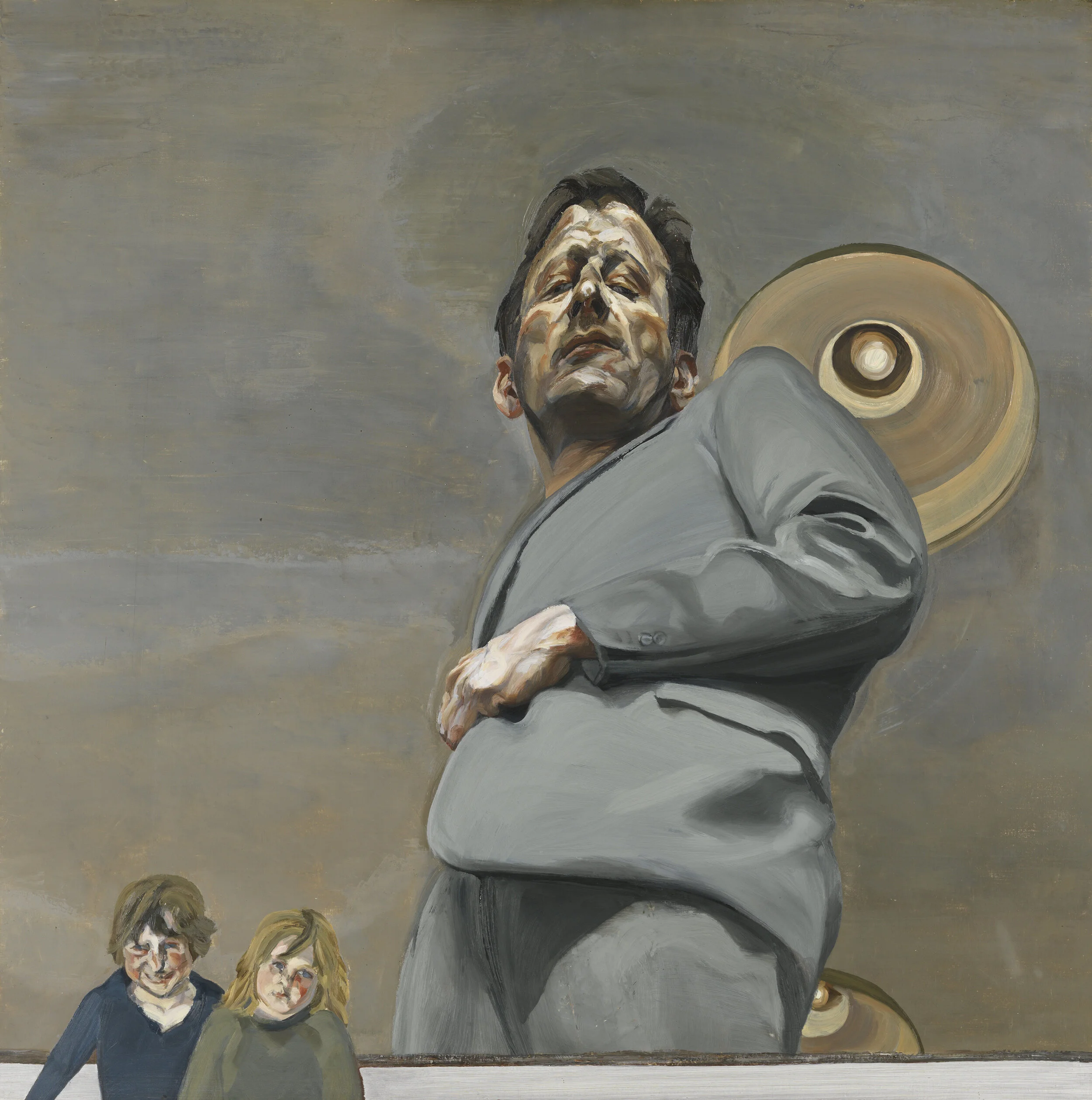
Reflection with Two Children (Self-Portrait) - Lucian Freud

Reflection with Two Children (Self-Portrait) - Lucian Freud

‘With self-portraits ‘likeness’ becomes a different thing, because in ordinary portraits you try to paint the person in front of you, whereas in self-portraits you’ve got to paint yourself as another person.’
Lucian Freud

I recently attended an excellent exhibition of Lucian Freud’s self-portraits (at the Royal Academy, London, until 26 January 2020).

Freud is renowned as a portraitist of quiet intensity. He engaged in what he called ‘biological truth telling,’ endeavouring to capture the physical reality of his sitters: his wives and mistresses, daughters and dogs, friends and acquaintances.

‘I work from the people that interest me and that I care about and think about in rooms that I live in and know.’

Typically Freud painted in his studio standing at his easel, applying thick layers of paint to the canvas with his large hog’s-hair brushes. He had his subjects sprawl naked on the floor, on a sofa or bed, at unusual or uncomfortable angles. His process involved long sittings and could take weeks or months. One woman needed osteopathy after her portrait. His conversation was light and witty, but his gaze was direct, frank and sometimes unsettling.

Freud  was particularly adept at capturing the texture and colour of flesh, employing Cremnitz White to suggest the skin’s luminous qualities. 

‘I want paint to work as flesh.’

Startled Man: Self Portrait, 1948. Photograph: © The Lucian Freud

Startled Man: Self Portrait, 1948. Photograph: © The Lucian Freud

Freud believed that, even when he painted other people, he was always painting himself – his perspective, his point of view, his particular relationship with the sitter.

‘My work is purely autobiographical. It’s about myself and my surroundings.’

And so when Freud painted his son Freddy we see the artist’s own reflection in the window. When he painted ‘Flora with Blue Toenails’ his shadow looms ominously over her in the foreground. And look, there are Freud’s feet at the foot of that sofa. There are a couple of his self-portraits leaning against a wall. He is ever present. 

'I thought, after putting so many other people through it, I ought to subject myself to the same treatment.'

Freud painted or drew his own image throughout his life. He holds up a white feather to us, a gift from his first girlfriend. He regards us through a houseplant, from the side of his wife’s bed. He looks startled and surprised - open mouthed and wide eyed, as if he has seen himself for the very first time. His lips are fleshy, his nose slightly twisted, his stare piercing. He appears sceptical, challenging. His face is covered in shadows that suggest the contours of his soul: a landscape of doubt, misgivings and resentment.

Bur despite his famous grandfather, Freud resisted psychological interpretations of his work. He was seeking physical not spiritual truth. He often drew his own image in his notebooks. Here we see his roughly sketched face surrounded by cryptic words: Prudent Miss, High Authority, Time To Reflect. We think for a moment that this may signify something rather important. And then realise he’s calculating his next bet on the horses. 

'Self-Portrait with a Black Eye' - Lucian Freud

'Self-Portrait with a Black Eye' - Lucian Freud

On one occasion Freud came away from an argument with a taxi driver with a black eye. He rushed back to the studio to capture his disfigured face, the dark swollen mess that his left eye had become.

‘I don’t accept the information that I get when I look at myself and that’s where the trouble starts.’

Freud painted himself with the aid of mirrors rather than photographs. He preferred natural light. Although he avoided having mirrors about the house, he set them up at various places around his studio, so that he could catch himself from unexpected angles. For ‘Reflection with Two Children’ he placed a mirror on the floor. He towers over us, his body foreshortened, sinister and threatening. Two of his children stand outside the composition. Are we seeing a child’s eye view of their father?

Of course, most of us nowadays are given to self-reflection in some form or another. We like to consider and compare our appearance, our character, our achievements. But for the most part we tend to look in the mirror square-on. We see a consistent picture of ourselves, from just one perspective. It is merely selfie-awareness.

Freud suggests that we should be sceptical of this image; that we should try to capture ourselves unawares; to see ourselves as others see us. If we want a proper reflection of our true self, why not ask our friends and colleagues, our partners and families? How do you see me? What do you make of me? What are my strengths? Where am I going wrong? We should seek to see ourselves from unexpected angles.

'I don’t want to retire. I want to paint myself to death.’

When he was 70 Freud painted himself nude for the first time. With unflinching frankness he conveyed the frailty of his ageing body, posing with unlaced boots, brandishing his easel and palette knife, proud of the tools of his trade. He kept reworking the portrait over several months, never quite satisfied.

‘I couldn’t scrap it, because I would be doing away with myself.’

'One day you're going to have to face
A deep dark truthful mirror.
And it's going to tell you things that I still love you too much to say.’

Elvis Costello, ‘Deep Dark Truthful Mirror'


 No 256

The Red Buoy: Beware Being Repositioned by the Competition

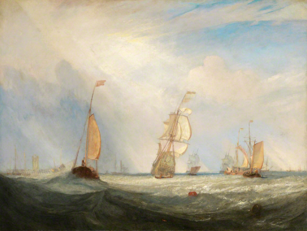
JMW Turner - Helvoetsluys

JMW Turner - Helvoetsluys

JMW Turner was born in 1775 in Covent Garden where his father was a barber and wig-maker. John Constable, born in Suffolk a year later, was the son of a wealthy corn merchant and miller.

Together these artists introduced a vibrant new way of depicting landscape. While their predecessors had set out to paint the natural world through mythical idealism or realistic accuracy, Turner and Constable sought to convey its true soul.

Turner painted shipwrecks, fires and fogs; violent seas and fierce storms; the smoke and steam of the industrial revolution. Constable was more gentle at heart. He painted picturesque waterways and working farms; elegant steeples, shimmering rainbows and gossamer clouds. 

Sadly the two artists never got on. Turner, who had been something of a child prodigy, regarded Constable as an upstart. Constable praised Turner in public, but in private described his work as ‘just steam and light’. In the Royal Academy exhibition of 1831 Constable had one of Turner's paintings moved from a prominent position and replaced with one of his own.

At the Royal Academy exhibition the following year Constable and Turner were assigned places alongside each other in one of the main galleries. Constable had been working on ‘The Opening of Waterloo Bridge’ for fifteen years. In the days before the exhibition, artists were allowed to apply a final coat to their paintings as they hung on the gallery walls. And so Constable painstakingly set about his finishing touches.

Turner was showing a sombre seascape, a picture of Dutch ships in a storm,‘Helvoetsluys’. Just before the exhibition opened, he realised his work suffered by comparison with Constable’s. And so he marched in and painted a small bright red buoy in the middle of his canvas. It drew the eye, creating a compelling contrast with the green sea around it. Turner left without saying a word.

Constable was incensed.

‘He has been here and fired a gun.’

The critics agreed that Turner’s simpler, more restrained work made ‘The Opening of Waterloo Bridge’ look complex, fussy and ostentatious. The exhibition was a disaster for Constable.

There’s a lesson for the marketing world here.

John Constable - The Opening of Waterloo Bridge

John Constable - The Opening of Waterloo Bridge

You may be going merrily about your business, doing a decent job, progressing steadily along the tracks. Your brand may be well regarded by consumers. Everything may be OK.

But then out of left field the competition does something radical that rewrites the rules; that reframes the market; that changes the way you’re viewed. Suddenly you no longer seem quite so relevant. You appear a little off the pace, a little out of sorts. Suddenly you look like yesterday’s brand.

BA was solidly respectable, thoroughly dependable. And then irreverent Virgin arrived on the scene and made it somewhat stuffy and old-fashioned. Levi’s was cool and contemporary. And then dissident Diesel appeared and made it safe and conventional. Orange made Vodafone feel corporate. Apple made Microsoft appear square. Sipsmith made Gordon's look dreary. Fever-Tree made Schweppes taste sweet. Eat made Pret seem over-sauced. And so on and so forth.

We should watch out for the seemingly insignificant red buoy that appears out of left field; the subtle touch of the brush that at a stroke makes us seem less relevant. We should beware being repositioned by the competition.

When we play it safe, we leave space for others to shine. If we want to be a leadership brand, we have to lead.


'When least expected,
Fate stumbles in.
Bringing light to the darkness,
Oh, what a friend.
I needed someone to call my own.
Suddenly, out of left field
Out of left field, out of left field
Love came along.’

Percy Sledge, 'Out of Left Field' (Dan Penn / Spooner Oldham)

No. 189

Inferior Design: Do Our Offices Inspire Creativity or Express Uniformity?

Matisse in his Studio

Matisse in his Studio

‘Objects which have been of use to me nearly all of my life.’
Henri Matisse, Note on the back of a photograph of his possessions, 1946

I recently attended an exhibition presenting works by Henri Matisse alongside the treasured personal possessions that inspired them. (Matisse in the Studio, The Royal Academy, London, until 12 November.)

Photos of Matisse in his studio revealed a man surrounded by carvings, bottles and textiles, porcelain bowls and pewter jugs. There were Arabic screens and African figurines. There was a Cambodian statue, Kuba embroidery and a Spanish vase. These artefacts were not particularly valuable, but they were more than just decorative. Clearly Matisse found them meaningful, provocative, suggestive. And they were very much present in his art.

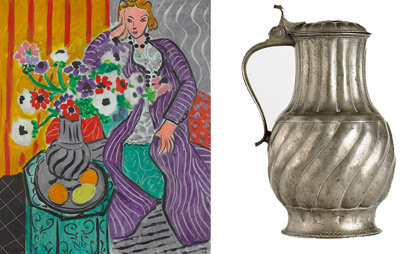
Matisse, 'Purple Robe and Anemones’ and the C18 pewter jug that inspired it.

Matisse, 'Purple Robe and Anemones’ and the C18 pewter jug that inspired it.

A silver chocolate pot Matisse received on his wedding day was depicted repeatedly, with differing degrees of abstraction; African masks prompted a serene style of portraiture; a Venetian rococo chair with a curious seashell design was interpreted from various perspectives; a marble Roman torso and a Chinese calligraphic panel induced vivacious colourful cut-outs.

‘The object is an actor. A good actor can have a part in ten different plays; an object can play a role in ten different pictures.’
Henri Matisse

Clearly context inspired the content of Matisse’s art. And he was not just representing these objects. They were catalysts, starting points, springboards for other thoughts and ideas.

‘For me the subject of a picture and its background have the same value…There is no principal feature, only the pattern is important.’
Henri Matisse

Legendary New York art director and designer George Lois took a different view of the work environment. For him decorative objects, furniture and pictures entailed distraction rather than inspiration. His office resembled a monastic cell - albeit a rather spacious and lofty one.

‘The only thing I ever permit on my desk is the job I’m working on. And, in my work place, there is nothing on the walls (except my nineteenth century Seth Thomas clock) to distract me from what I’m supposed to be thinking about on my desk.’
George Lois

George Lois’ office at Lois Holland Callaway, 1969

George Lois’ office at Lois Holland Callaway, 1969

Matisse and Lois had decidedly different perspectives, but they shared an understanding that their working context contributed to their creative content.

I’m sure every one of us can recall distinctive work environments that we’ve come across over the course of our careers.

When I joined BBH in the early ‘90s, its Great Pulteney Street offices boasted an austere industrial aesthetic. It was all black, steel, chrome and glass; racked televisions, exposed pipes and rubberised flooring. This look was completely consistent with the Agency’s positioning at the time as an ‘ideas factory.’ It had an attractive tone of confidence and professionalism.

In John Hegarty’s office at BBH you found a painting of an empty box, a large Q & A design and a stuffed black sheep - constant reflections on the power of ideas and the imperative of difference. Next door you could see Nick Gill’s wall of punk singles, which called to mind his personal passion and independent spirit. Nigel Bogle’s space was closer to the Lois model: simply furnished with a few framed award-winning ads, just to ensure we all knew the standard we were aiming at.

I’m afraid my own work environment was often overrun with piles of paper. I could trace files and documents chronologically by their distance from the top (like the layers in the archaeological site at Troy). Nigel rather generously once suggested ‘untidy desk, tidy mind’, but I fear the towers of A4 just betrayed my paranoia about lost knowledge. I changed office many times over the years. And wherever I laid my hat, I hung twelve photos by Daniel Meadows. In the rarefied world of Soho advertising, I found these ‘70s images of ordinary British folk gently nostalgic and reassuring – a land that time forgot.

Clearly an office speaks – about each of us as individuals, and all of us as a company. So we should give proper thought to what we’re saying.

‘Your working surroundings should not be a presentation to your Clients…And your home should not be a presentation to your friends. Surroundings should relate to who you are, what you love and to what you deem important in life.’
George Lois

I confess I’m no fan of the current conventions in creative office design - conventions now shared, with bigger budgets, by our Clients: the reclaimed wooden tables, the high chairs and industrial lighting; the brightly coloured walls and quirky shaped sofas; the suggestive neon words and slogans; the themed breakout areas and table football; the juice bar, coffee station and artisanal cookies; the beach-hut workstations, the meeting rooms named after Bowie songs; the climbing walls, playground slides and bouncy castles…

Sometimes we equate juvenility with creativity. Sometimes our work environments encourage recreation rather than inspiration, conformity rather than diversity. Sometimes they seem designed for longevity of attendance, not quality of output.

Of course, nowadays few of us are fortunate to have our own personal offices. Whilst we can create context on our desks and screens - and we can create seclusion through our headphones - for the most part our employers control our environments.

Nonetheless, we should still ask ourselves how we’re using the space that surrounds us. Where do we stand on the spectrum from Matisse’s gallery of mementoes, to Lois’ self-conscious minimalism? Does our office environment encourage inspiration or concentration? Does it provide stimulus or distraction?

Environmental design is strategically critical to the culture that a modern business is trying to encourage, and the sense of self it’s seeking to convey. Shouldn’t a creative business curate space, stimulate ideas, spark the imagination? Shouldn’t we be developing diverse, productive studio environments, not happily homogeneous corporate habitats? Shouldn’t our context inspire our content?

Daniel Meadows 'National Portrait' 1974

Daniel Meadows 'National Portrait' 1974

No. 146

‘They Shoot Horses, Don’t They?’ How Do We Put an End to Work Marathons?

Still from from the film: They Shoot Horses, Don’t They?

Still from from the film: They Shoot Horses, Don’t They?

‘Yowza! Yowza! Yowza! Welcome to the dance of destiny, ladies and gentlemen. Around and around and around we go, and we’re only beginning, folks, only beginning! On and on and on, and when will it stop? When will it end? When? Only when the last two of these wonderful, starry-eyed kids are left. Only when the last two dancers stagger and sway, stumble and swoon, across the sea of defeat and despair to victory.’

Rocky the MC, in the opening sequence of ‘They Shoot Horses, Don’t They?’

I recently attended an excellent exhibition of American paintings from the 1930s. (America After the Fall, Royal Academy, London, until 4 June.) With work by the likes of Edward Hopper, Grant Wood and Thomas Hart Benton, we see the bold geometric shapes of America’s industrial landscape alongside the sweeping curves of its endless open spaces. We see cities teeming with life, bursting with entrepreneurial energy, stumbling from the body blow of the Wall Street Crash. We see austere rural communities staring the Great Depression in the face.  

I was particularly struck by a 1934 image by Philip Evergood depicting one of the Dance Marathons that were popular across America during the Depression. In these grim endurance contests, which foreshadowed the reality TV shows of today, spectators paid to watch couples dance continuously for weeks on end. In Evergood’s painting the competitors cling to their partners, seemingly dead on their feet, as they enter the forty-ninth day of a tournament to win $1000. At the fringes bored spectators look on.

Rocky: ‘It isn't a contest. It's a show.’

Philip Evergood 'The Dance Marathon'

Philip Evergood 'The Dance Marathon'

A Dance Marathon on Santa Monica Pier is the setting for the 1969 movie ‘They Shoot Horses, Don’t They?’ starring Jane Fonda and Michael Sarrazin. It’s a dark, sad story which clearly suggests the gruelling contest is a metaphor for a society gone wrong: the dispossessed and down-at-heal subscribe to an exhausting, degrading show where there are only two winners - and even their victory will ultimately be hollow. The tragedy is that none of the contestants can see an alternative. Desperate for the prize money, they sign up and struggle on of their own accord.

Rocky: ‘I may not know a winner when I see one, but I sure as hell can spot a loser.’

Reflecting on Dance Marathons, I found myself thinking of the modern world of work. We all continue to dance, as our working hours steadily increase; as our lunch hours are squeezed and our holidays deferred; as our ‘week-end’ transforms into our ‘week-beginning;' as the boundaries between home and work collapse; as tech enables us to be ‘always on,’ and consequently our work is ‘never off.' We’re putting our bodies and brains under ever increasing pressure. In a sense we’re all voluntarily engaged in our own Work Marathons.

Work Marathons not only deprive individuals of engaged and happy family lives; they also deprive businesses of engaged and happy employees. This is particularly true for creative businesses where the richness of colleagues’ hinterlands relates directly to the richness of their conceptual contributions.

How can you have a hinterland if you’re hardly ever home? How can you have a transformative idea if you have no transformative experiences? How can you demonstrate empathy with consumers when you have no time to meet any?

One curiosity of today’s overwork culture is that it afflicts seniors as much as juniors. I was particularly depressed to read recently that many American CEOs take pride in working over 100 hours per week, and that Apple’s Tim Cook starts work at 3-45AM. (The New Status Symbol, The Guardian, 24 April 2017). Everyone talks about agile working, but 100-hour weeks don’t sound very agile to me. Surely top CEOs don’t need to do this. Perhaps they enjoy it. (The Guardian journalist, Ben Tarnoff, suggests that the elite's conspicuous consumption is being supplemented by ‘conspicuous production.’) Whatever their motivation, they are setting a standard by which their employees will inevitably be measured.

Of course, the necessary recalibration of work-life balance should start with our leaders. They need to set an example. But what about the rest of us? Do we just keep on dancing ‘til the rhythm changes?

It has been pointed out that we should never complain about a traffic jam because by being in it we’re contributing to the problem: ‘You aren’t stuck in traffic. You are traffic.’ In the same way perhaps, we all consider ourselves victims of overwork culture, when in truth we’re probably partially responsible for it. We all fix that meeting, set that deadline, send that email, demand that attendance, revise that brief.

Male Dancer: ‘Anyone ever told you…?
Gloria: ‘Yeah, they told me.’

I suspect we know the answers already. We just need to apply them. We should set aside presenteeism, micromanagement and over-engineered solutions. We should properly embrace empowerment, expertise, velocity, agility. In short:

Don’t control the process; trust the team.
Don’t double up on tasks in the name of representation; respect roles and responsibilities.
Don’t celebrate longevity; reward intensity.
Don’t obsess about inputs; concentrate on outputs.
Don’t deal with it after the meeting; solve it in the room.
And don’t send it at the weekend; save it ‘til Monday morning.

I also read recently that the inventor, designer and manufacturer James Dyson only receives six work emails a day (Vacuum Your Emails, Sunday Times, 7 May 2017). It’s true that sometimes email management creates merely the illusion of work – email is often an anodyne, short-term distraction from building real relationships and finding long-term solutions. Of course, Dyson has the advantage of being in charge and having a secret email account. But maybe he’s onto something.


This piece was written to mark Mental Health Awareness Week

No. 130

NOTES FROM THE HINTERLAND 5

‘Words Without Thoughts Never To Heaven Go’

Bernardo: ‘Who’s there?’
Francisco: ‘Nay, answer me: stand and unfold yourself.’
Hamlet, I i.

Some have argued that the opening lines of Hamlet are entirely appropriate: this night-time exchange between two guards on the walls of the castle at Elsinore immediately establishes a sense of doubt about identity, a theme that sustains us through the play.

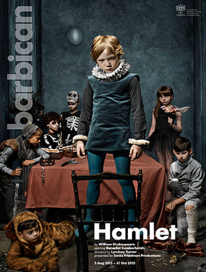
In a bold break with tradition, the director of the Hamlet currently being staged at The Barbican in London chose instead to start her production with the famous ‘To be or not to be’ soliloquy. Too bold for some, and it was announced last week that the experiment would be discontinued.

Should one side with the purists and demand respect for genius and tradition? Or should one applaud brave endeavour, even when it doesn’t succeed?

I found that, the longer I was in business, the more I had to guard against instinctive conservatism. ‘We’ve tried that before. It didn’t work.’ Age and experience can at once enhance one’s judgement and diminish one’s appetite for change.

I saw the Barbican Hamlet in preview. Benedict Cumberbatch has a strong, charismatic take on the troubled Prince; the sets are magnificent; and the production has many good ideas.

When you revisit great works, different scenes leap out at you. This time I was struck by the passage in which Hamlet’s uncle, the villainous Claudius, who has murdered Hamlet’s father and married his widow, tries to pray for forgiveness. At length Claudius concedes that, since he is still in possession of ‘my crown, mine own ambition and my queen,’ he cannot hope for absolution. His prayers are empty without genuine remorse.

‘My words fly up, my thoughts remain below:
Words without thoughts never to heaven go.’
Hamlet III, iii

Creative businesses are sadly cursed by hollow words and empty promises. We all too publicly worship at the altar of creativity without properly demonstrating our faith in day-to-day behaviour. Talk is cheap. And our belief is sorely tested when the god Mammon steps into the meeting room. Perhaps we should, like Claudius, appreciate that ‘words without thoughts never to heaven go.’


Scepticism Is Healthy for Business Too

Trouble in Paradise is a sophisticated screwball comedy from 1932, directed by Ernst Lubitsch. A romance between two upmarket con artists is tested when one of them falls for a society heiress, their next intended victim.

The film is fast paced, knowing and wry. And so beautifully written. The society heiress, Madame Colet, rejects a suitor’s advances thus:

‘You see, Francois, marriage is a beautiful mistake which two people make together. But with you, Francois, it would be a mistake.’

It’s reassuring to discover that scepticism about advertising and business was alive and well in the ‘30s. Madame Colet has inherited a perfume business and her brand is advertised thus:

‘Remember, it doesn’t matter what you say. It doesn’t matter how you look. It’s how you smell.’

In another scene Giron, the Chairman of the Board of Colet et Cie, confronts our hero Gaston, now acting as Madame Colet’s advisor:
Giron:  ‘Speaking for the Board of Directors as well as for myself, if you insist in times like these in cutting the fees of the Board of Directors, then we resign.’
Gaston:  ‘Speaking for Madame Colet as well as for myself, resign.’
Giron:  'Very well…We’ll think it over...’

I understand that in this month’s Alphabet announcement there was a nod to the HBO comedy Silicon Valley (The Guardian, 11 Aug 2015). There’s a great tradition of comic writing about commercial culture. The Office reflected business life as it is, not as we would want it to be. Nathan Barley shone a light on Shoreditch lunacy, with extraordinary prescience and what now looks like understatement. And the recently departed comic genius, David Nobbs, gave us Reggie Perrin, the middle management mid-life crisis that is sadly all too familiar.

Scepticism is healthy. It calls business to account. It shows that the public is alert to our shortcomings.
Better to be mocked than to be ignored.


Can Commerce Integrate Art and Science?

The Festival of the Opening of the Vintage at Macon by JMW Turner shows ordinary folk dancing in a beautiful bucolic scene. A few years ago research was published indicating that Turner’s depiction of the sun in this painting was based on the latest scientific thinking of his day. (The Guardian, 13 November 2011)

It transpires that Turner, whilst studying art at the Royal Academy, also attended science debates at the Royal Society, which was housed in the same building. And in particular it is suggested that Turner attended the lectures of the astronomer William Herschel, who had been examining the surface of the sun.

As an artist Turner was comfortable with, and actively interested in, science. The scientist Michael Faraday was a good friend and he knew mathematicians, palaeontologists and chemists. Science inspired him. His commitment to observe nature first hand is captured in the myth that he lashed himself to a mast during a storm, just so that he could understand the conditions; an experience that supposedly prompted my favourite Turner painting, Snow Storm - Steam Boat Off A Harbour’s Mouth. 

I regret to say that, when I grew up, art and science were taught as polar opposites. We imagined that scientists had different shaped brains and we rarely socialised with them. This dualism extended even to our TV viewing: the scientists watched The Body in Question; we arts scholars watched Brideshead Revisited (the show that launched a thousand fops)…

It’s compelling to note that many of today’s more interesting movies, dance and theatre productions concern themselves with science. The Theory of Everything had us trying to keep up with Stephen Hawking; the great Wayne McGregor creates dance inspired by neuroscience; Nick Payne’s recent Royal Court hit, Constellations, looked at a human relationship in the context of quantum multiverse theory.

Though I’ve barely a scientific sinew in my body, I believe that the future of marketing and communications will occur at the intersection between art and science. It’s logical. It's inspiring.


No. 44

NOTES FROM THE HINTERLAND 2

Thinking Inside the Box

This week I visited the excellent Joseph Cornell exhibition at The Royal Academy. Cornell spent most of his life in New York State and never left America. But through his art he voyaged across continents and through time. In a week in which Pixar launches a film exploring the brain of an 11 year old child, the Cornell exhibition is a jouney into the mechanics of a creative mind.

Although Cornell didn’t travel, he read extensively and compiled dossiers on subjects that interested him, whether that be astronomy, ornithology, circuses, childhood games or nineteenth century France. Drawing on the contents of these dossiers and combining them in imaginative ways, Cornell painstakingly constructed collages, mechanicals and glass fronted ‘shadow boxes.’ His boxes contained fantasy hotels, tropical birds, celestial maps. He created fictional lives, shooting galleries, slot machines and an interactive Museum of Sound (including ‘the sound of silence’ which I guess belongs in a museum nowadays…).

It’s often been said that travel narrows the mind. Cornell demonstrated that a creative imagination can take us to exotic places without setting foot outside one’s home town.

What can we in the creative professions learn from Cornell?

Could we do more to capture and collate experiences and thoughts that would otherwise pass unexpressed and unremembered?

Are we misleading ourselves when we imagine that our exotic holidays are fuelling our imagination? Would we be better off just reading more?

In the age of consumer insight and user experience, do we give proper weight to the pure transformative power of dreams?

Cornell loved poetry and he dedicated his piece Toward the Blue Peninsula to the similarly private Emily Dickinson. The work refers to a Dickinson poem that considers the choice of an imagined, over an experienced, life.

‘It might be easier
To fail - with Land in Sight-
Than gain – my Blue Peninsula -
To perish - of Delight -’

Emily Dickinson/ It Might Be Lonelier
 

Carving, Not Casting; Making Not Managing

I also attended the splendid retrospective of the sculptor Barbara Hepworth at Tate Britain. Beautiful contemplations in form and space, surface and light. Hollowed out solids, wires casting shadows. Polished and painted, curved and scooped. Lovely.

In her early career Hepworth participated in the ‘direct carving’ movement: artists carving directly into wood and stone, respecting the truth of the materials; rather than casting sculpture into a mould or employing skilled craftsmen to execute a model. Initially the direct carvers’ works were a little cruder, a little more rudimentary, than those produced by the incumbent methods, as the artists learned the craft skills themselves. But there was a compelling simplicity and honesty about the results.

I wonder what would a rededication to direct carving look like in the communication arts?
What if all our creatives shot their own film, designed their own posters, wrote their own code, built their own applications?
What if we rejected our fragmented, demarcated world and rededicated our selves to ‘making not managing’?
 

Wasted Talent

On Friday afternoon I sat on my own in a cinema weeping to the Amy Winehouse documentary. It was like watching a car crash in slow motion. From the start you could see the ending, but there was nothing you could do to stop it.

There seem to have been many contributors to poor Amy’s demise; not least her determination to ‘sabotage her own life’. And I couldn’t escape a sense of complicity. I’d read those papers, consumed those news stories; I was watching the film.

But the abiding impression I took from Amy was of waste: wasted talent, wasted love, wasted life. In our disposable culture we imagine that talent, like everything else, is readily replaceable. But it isn’t.  And we’ll not see the like of Amy again in our lifetimes.

I wonder, are creative businesses wasting the very talent that sustains them?
Shouldn’t we be protecting talent as our most precious commodity?
Should our new-found commitment to sustainability extend to people, not just resources?

And, by the way, the film wasn’t entirely depressing. Tony Bennett emerged as a wise, gentle, luminous star. If only there were more like him…

Advice to My 17 Year Old Self

Work hard, but not at the expense of your cultural life.
Study hard, but not at the expense of your social life.
Play hard, but not at the expense of your health.

N0. 39