The Net Curtain Strategist

Refaela Revach Looking out the window Painting

My childhood home in Romford looked out onto Heath Park Road, a relatively busy suburban street, lined with neat front gardens and pebble-dashed, semi-detached houses.

Over the rain-sodden school holidays my brother Martin and I often found ourselves stuck indoors, and our mother would invent tasks to occupy our time.

For one such assignment, she located us on stools by the living room window, supplying paper, pencils and a glass of squash. She then asked us to record the different colours of the cars passing by the house, in order to establish which shade was most popular.

‘Blue!’ ‘Red!’ ‘Blue!’ ‘Yellow!’

Eagle-eyed and attentive, with every new vehicle we added another stroke to a five-bar gate, setting about our objective with high seriousness.

I can’t say it was a particularly challenging or instructive exercise. Sometimes a metallic finish or striped van prompted a bit of debate. Sometimes the cars came past in a mad flurry all at once. And this being the ‘70s, most of the cars were just blue or red. (The black automobile was a rare sight back then.) 

Nonetheless, we spent many happy hours at that bay window.

Our monitoring of the traffic on Heath Park Road was given an extra frisson by the fact that, like secret agents, we were working unnoticed and out of sight. Most homeowners back then protected their privacy by hanging net curtains. These enabled residents to see out, but prevented passers-by from seeing in – a phenomenon quite beyond my crude understanding of science.

Over recent years the Planning discipline has grown in respect and recognition in the broader Agency community. We celebrate great insights and approaches. We cultivate our own flamboyant presentational styles. We lionize the best practitioners.

This is all of course to the good.

I would nonetheless suggest that for the most part good strategists work as if behind net curtains. Largely anonymous, quietly observing, seeing without being seen, they are unobtrusive and understated. They are also mindful of avoiding the Observer Effect, by which the act of measurement disturbs the object measured.

I am reminded that the great John Bartle, one of the BBH Founders, argued that Planners should contribute ideas without claiming authorship; that there is more chance of collective success if individuals are not striving for acknowledgement; that the best strategists are generous at heart.

‘Success has many parents, failure is an orphan - be happy to let others take the credit and success is more likely.’
John Bartle


I have occasionally wondered whether it was my mother’s car-monitoring exercise that set me on the path to strategy and research. Perhaps. But I’m not sure I ever really excelled at quantitative data and analysis.

'Every day now I can feel you watching me from afar,
And you've been leaving those love letters on my car.
So now I wonder, why you're so into me, in such a way
That you've got to take your spare time to chase after me.
What a shame.
So you like what you see?
Hey, you better put a hold on me.
So you like what you see?
Girl, you better put a hold on me.’
Samuelle, '
So You Like What You See’ (Samuelle, Foster & McElroy)

No. 470

Lady in the Lake: Distinctive Film Techniques Can Either Enhance or Obstruct 

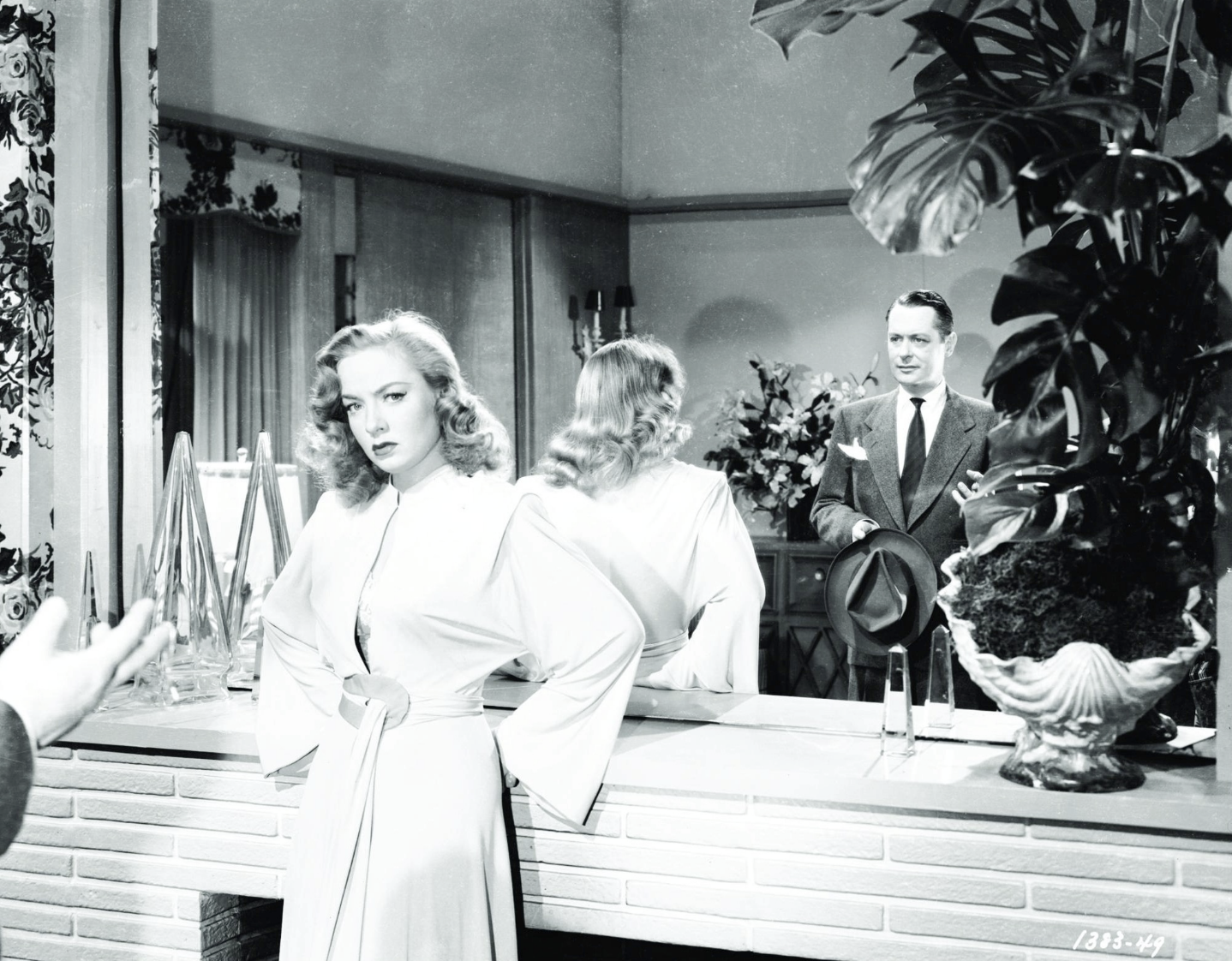
Robert Montgomery and Audrey Totter in Lady in the Lake (1946)

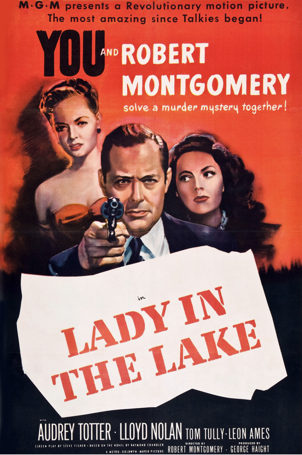
‘MGM presents a revolutionary motion picture. The most amazing since Talkies began! You and Robert Montgomery solve a murder mystery together!’

The 1947 movie ‘Lady in the Lake’ is based on the Raymond Chandler novel of the same name. In many ways it’s a typical film noir, following hard-boiled LA private detective Philip Marlowe as he navigates a world of murder, mystery and a missing woman. There are crooked cops, unreliable witnesses and an enchanting femme fatale; cynical double-crosses, brutal violence and a crisp, caustic script.

'My name is Marlowe, Philip Marlowe. Occupation: private detective. You know, somebody says, ‘Follow that guy’, so I follow him. Somebody says, ‘Find that female’, so I find her. And what do I get out of it? $10 a day and expenses. And if you think that buys a lot of fancy groceries these days, you're crazy.’

What distinguishes ‘Lady in the Lake’ is the decision of lead actor and first-time director Robert Montgomery to use point-of-view cinematography: the viewer experiences the entire drama from Marlowe’s perspective.

‘You’ll see it just as I saw it. You’ll meet the people. You’ll find the clues. And maybe you’ll solve it quick and maybe you won’t.’

The subjective camera tracks along corridors and up staircases. It looks to left and right to review the situation, and then focuses in on the key protagonists, who address us directly. We see a hand on the door handle as Marlowe enters a room; smoke billows before us as he lights a cigarette; and the leading lady even gives us a kiss. On a number of occasions we catch Marlowe’s reflection in the mirror. And when he is punched in the face, we tumble to the floor and everything goes woozy. 

'Perhaps you'd better go home and play with your fingerprint collection.’

It was quite a challenge sustaining the point-of-view approach through the whole picture. To capture Marlowe’s walking movement the production team employed a new kind of dolly, with four independent wheels. A seat for Montgomery was attached at the front, so that the actors could respond to him. And for the fight scenes a camera with a flexible shoulder harness was used.

'I wonder how it would be to discuss this over a couple of ice cubes. Would you care to try?’
'Imagine you needing ice cubes.’

However, the production was problematic. Scenes planned for the lake of the title were cancelled because the technique proved difficult to execute outdoors. MGM studio bosses became frustrated that their expensive leading actor barely appeared on-screen, and insisted on the insertion of a number of awkward explanatory interludes where Marlowe reviews events afterwards in his office. They also demanded a happy ending.

‘Now what am I supposed to do? Reform? Become poor-but-honest? On what street corner would you like me to beat my tambourine?’

Watching the film today, initially the effect is intriguing. The characters seem to be addressing us personally. We feel involved in the action. We encounter the twists and turns of the plot as if we are detectives. We are Philip Marlowe! 

But over the one hour and three quarters running time, the approach becomes a little wearing, somewhat artificial. It is as irritating as it is interesting.

'Please don't be so difficult to get along with. I need help.’
'Like I need four thumbs.'

Robert Montgomery, Audrey Totter in Lady in the Lake (1946)

In the course of my career in advertising we often developed commercials that employed a distinctive technique. We played scenes backwards, slowed them down, re-ordered them and mixed filmic styles. We explored original editing, unusual music, eccentric sound effects, and more besides. 

Sometimes a fresh technique succeeded in prompting involvement; in drawing attention to the core idea. Sometimes it just got in the way. It was always a calculated risk.

Perhaps BBH’s most successful such experiment in my time there also involved point-of-view camerawork: Levi’s 1993 ad ‘Drugstore.’ 

We follow events from the perspective of a young man as he buys condoms from a general retailer and pops them in the watch-pocket of his 501s. He drives to his girlfriend’s house to take her on a date. When he knocks on her door, it is opened by the man who made the sale - her surprised, and concerned, father. The endline reads: 'Watch pocket created in 1873. Abused ever since. Levi’s 501. The Original Jean.’

What sets ‘Drugstore’ apart from other technique-based executions is the sheer quality of the filmmaking. Nick Worthington and John Gorse’s script had at its heart something of a Benny Hill gag. But they chose exceptional director Michel Gondry to shoot it with style and panache – with suggestions of ‘Grapes of Wrath’ and O Winston Link. And they selected a contemporary electronic soundtrack by Biosphere to give it an eerie, haunted quality. And to keep people on their toes, they also filmed a gender-switch version where the young woman buys the condoms.

In the midst of all this inventiveness the point-of-view camera technique enhances rather than obstructs the drama. And maybe that’s the lesson.

‘You stick your nose into my business and you’ll end up in an alley where the cat’s looking at you.’

So what became of ‘Lady in the Lake’?

Well, Chandler, whose own version of the script had been rejected, was unimpressed with the finished product and demanded that his name be removed from the credits. Critics were also largely underwhelmed. And Montgomery, who had been under contract with MGM since 1929, never made a film with them again. 

Despite all this, the movie was a box-office success.  And perhaps this was the biggest mystery of all.


'Put yourself in my place
If only for a day.
See if you can stand
The awful hurt I feel inside.
Put yourself in my place
For just a little while.
Live through the loneliness
The endless emptiness
I go through.
And when you lose a little sleep at night
Cause you ain't been treated right,
Then you know heartaches are sad.
Sitting by the telephone
Being left all alone,
Then you know why I'm feeling bad.
Put yourself in my place.’

The Elgins, 'Put Yourself in My Place’ (Holland–Dozier–Holland)

No. 442

Reboot, Relocate, Reimagine: Making Best Use of Traditional Myths and Historical Literature

Constance Devernay-Laurence in Coppelia. Photo: Andy Ross.

‘Coppélia’ is a late 19th century comic ballet, choreographed originally by Saint-Léon and then Petipa, and set to the music of Delibes. Its narrative derives from a Hoffmann short story in which a reclusive inventor crafts a dancing doll so lifelike that a village youth falls madly in love with it. 

I have seen the work a few times and come to the conclusion that it is a somewhat silly museum piece. 

I recently attended a performance by Scottish Ballet of its new version of ‘Coppélia’, choreographed by Morgann Runacre-Temple and Jessica Wright (Sadler’s Wells, London). The drama has been relocated to Silicon Valley and the inventor is now a black polo-neck wearing tech titan. In his NuLife lab he is creating Coppélia, an AI woman that he hopes to transform into a cyborg. A young man becomes besotted with the digital automaton.

With its futuristic candy-coloured costumes, suggestive of ‘Metropolis’; its athletic bobbed dancers; and its elegant integration of screen technology, this new ‘Coppélia’ is smart, slick and dazzling. In rebooting the ballet, the dance-makers have successfully embraced themes of tech megalomania; clones and the metaverse; the nature of 21st century relationships. ‘Coppélia’ has been reborn.

I can think of quite a few theatre productions I’ve seen over the years that have relocated or reimagined a traditional story or historic work, and in so doing have transformed it into something completely contemporary.

When Shakespeare’s ‘Henry V’ was transposed to the Iraq War, the ethical issues of the conflict seemed terribly real. When Macbeth was recast as a 20th century African warlord, the fierce brutality at the heart of the drama struck home. When Hamlet and Ophelia were presented as gaunt student goths, the audience was prompted properly to consider their fragile youth.

Bruno Micchiardi as Dr Coppelius. Photo: Andy Ross

In 2018 director Marianne Elliott swapped the gender of the main character in Stephen Sondheim’s 1970 musical ‘Company.’ Whereas the traditional male lead in this role can come across as careless and complacent, here we were presented with a successful woman in her mid-30s, unable to commit to a steady relationship and confronted with a ticking clock. It was much more interesting.

'Success is a journey, not a destination. It requires constant effort, vigilance and re-evaluation.’
Mark Twain

Of course advertising campaigns have often drawn on established cultural motifs to achieve immediate recognition and shared reference points.

Back in the day my own Agency, BBH, produced a Lynx/Axe ad that reimagined the fantasy film ‘One Million Years BC’; an Audi ad that channelled Jimi Hendrix; and a Boddington’s ad that mimicked Rene Magritte. And more besides.

The most interesting cultural appropriations not only borrowed from a source story. At the same time they introduced some new interpretation of that tale and integrated the brand in a compelling way.

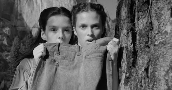
In 1992 BBH shot a Levi’s ad based on the Cinderella myth. In this version the protagonist in search for love is not a male prince, but a female heroine. She must find the one man who can fit into a discarded pair of worn 501s. Because ‘no two pairs are the same.’

In 2012 The Guardian employed the fable of the Three Little Pigs as a platform to showcase the power of live, participative news reporting; of expert, campaigning journalism across multiple platforms.

At their best commercial reboots, relocations and reimaginings both borrow from, and invest in, the original myths and legends. They make both the story and the brand more relevant.

Inevitably not every new theatrical interpretation I’ve seen has been entirely successful.

One summer my wife and I treated ourselves to some country house opera, booking to see 'La Bohème' at Glyndebourne. As we drove down through rural Sussex, we put behind us the stress, grit and grime of urban life. It was a proper escape. However, this production of the Puccini classic transposed its impoverished artists from the Latin Quarter of 1840s Paris to the hipster scene of present day Hoxton in East London. This was indeed a sound directorial decision. Sadly we’d driven three hours to arrive at a familiar place just a mile from home.


'Back to life, back to the present time,
Back from a fantasy.
Tell me now, take the initiative.
I'll leave it in your hands, until you're ready.
How ever do you want me.
How ever do you need me.’

Soul II Soul, 'Back to Life (However Do You Want Me)’ ( Jazzie B, C Wheeler, N Hooper, S Law)

No. 412

Living in a Lorem Ipsum World: Sometimes We Need to Talk Less and Say More

Bust of Marcus Tullius Cicero

'The ability to simplify means to eliminate the unnecessary so that the necessary may speak.'
Hans Hofmann

When I first entered advertising, I was quite taken with the employment in typesetting of ‘lorem ipsum’: dummy text that acted as a placeholder in layouts until the proper copy was written.

'Lorem ipsum dolor sit amet, consectetur adipiscing elit, sed do eiusmod tempor incididunt ut labore et dolore magna aliqua. Ut enim ad minim veniam, quis nostrud exercitation ullamco laboris nisi ut aliquip ex ea commodo consequat….’

In developing press ads we would establish the headline, image and art direction first, and leave the precise copy for a later date.

‘Just ‘lorem ipsum’ it for now.’

‘Lorem ipsum’ has been in use in the printing world since the 1500s. Nowadays you’ll see it in web-build and digital publishing. It is often referred to as Latin gibberish. But in fact the standard text derives, albeit in corrupted form, from a treatise on ethics by the ancient Roman lawyer, politician and writer Marcus Tullius Cicero.

‘Lorem ipsum’ starts mid-way through a sentence:

‘Neque porro quisquam est, qui dolorem ipsum quia dolor sit amet, consectetur, adipisci velit, sed quia non numquam eius modi tempora incidunt ut labore et dolore magnam aliquam quaerat voluptatem.’

These lines have been translated as follows:

‘Nor again is there anyone who loves or pursues or desires to obtain pain of itself, because it is pain, but because occasionally circumstances occur in which toil and pain can procure him some great pleasure.’

This passage suggests that first century BC writers could be as prolix as their twenty-first century equivalents. Cicero should perhaps have limited himself to a simpler sentiment:‘No pain, no gain.’

'Writing is 1 percent inspiration, and 99 percent elimination.’
Louise Brooks

I spent nearly all of my time in advertising at BBH, an agency whose creative output was led by an art director. As a result it had a very particular relationship with words. We liked a precise, provocative headline; an insightful, memorable endline. But we were consistently cautious around long copy. Many’s the time I sat in a script review with co-founder John Hegarty when he would approve the overall idea, but ask for the dialogue to be stripped back, or erased completely.

‘I’m not sure we really need all those words, do we?’

Sometimes nowadays it feels like we live in a ‘lorem ipsum’ world. Everywhere we look - in business meetings and in the media; amongst clients and colleagues, politicians, and journalists - there seems an incredible capacity for producing dummy text. People trot out cliches and platitudes, sound-bites and slogans. They just drone on - without hesitation or deviation, but with a good deal of repetition - until they are interrupted or muted. They’re ‘talking loud and saying nothing.'

'Be sincere, Be brief, Be seated.'
Franklin Delano Roosevelt

The ability to speak continuously with confidence is a talent of sorts. But, over the course of my working life, I found that the colleagues who had the most impact on meetings, and whose careers advanced with the greatest velocity, were those who restricted themselves to fewer and better statements; more concise and memorable observations; more thoughtful and provocative ripostes.

Perhaps we should all learn to talk less and say more.

'Don't tell me
How to do my thing,
When you can't, 
Can't do your own.
You're like a dull knife,
Just ain't cutting.
You're just talking loud
And saying nothing.’

James Brown, 'Talkin' Loud and Sayin’ Nothing’ (B Byrd / J Brown)

No. 399

Designing the Beautiful Game: Play Better, Look Better, Earn Better

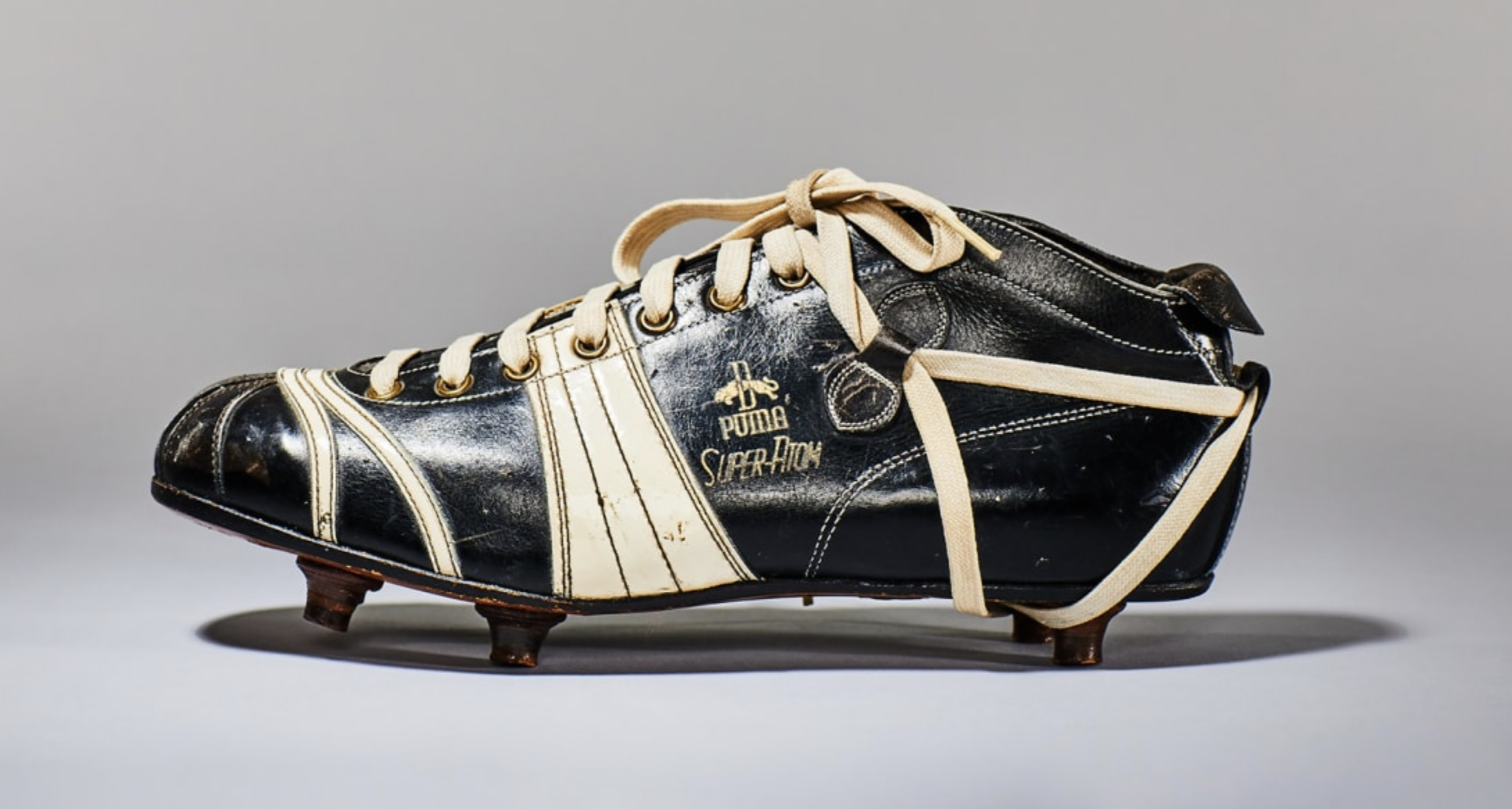
Photo credit: Puma archive

'Behind every kick of a ball, there has to be a thought.’
Denis Bergkamp

I recently visited an excellent exhibition exploring the role of design in the development of football. (‘Football: Designing the Beautiful Game’ is at the Design Museum, London until 29 August.)

On entering the gallery you encounter a Zambian ball made from a maize meal sack tied with string. It serves to reinforce the simplicity of the game that has made it so broadly popular.

'One of the reasons football is the most popular sport in the world is because the weak can beat the powerful.’
Marcelo Bielsa

You can see displays of historic balls, boots, banners and badges; archaic shinpads, pumps and goalkeepers’ gloves; the Acme Thunderer, the world’s original sport whistle, invented by a Birmingham toolmaker in 1884.

You can admire George Best’s first pair of boots – on the sides, in neat white painted letters, he recorded the games in which he scored. You can marvel at number 10 shirts worn by Platini, Messi, Zico and Maradonna.

'It’s true I don’t know much about the players here, but they definitely know who I am.’
Zlatan Ibrahimovic (on joining PSG in 2012.)

You can learn that the iconic Brazilian strip, incorporating the four colours of the national flag, was designed by an 18 year old newspaper illustrator. He was responding to a competition after the humiliating loss to Uruguay in the 1950 World Cup Final, when the team wore an all-white kit.

You can observe design’s impact beyond the pitch: from a rudimentary rattle to the reviled vuvuzela horn; from promotional posters to match day programmes and fanzines. There’s Coventry’s splendid Sky Blue programme, which won a D&AD prize in 1972. There are displays about innovative stadium architecture: the San Siro, the Allianz Arena, Tottenham Hotspur and Forest Green Rovers. 

I noted with a pang of melancholy that Spurs’ sophisticated acoustic modelling has not been applied at West Ham’s London Stadium. Indeed, as far as I could see, the Hammers’ main contribution to the exhibition was a hooligan calling card…

One of the two match balls used in the 1930 World Cup final, supplied by Argentina and used in the first half. Credit: Neville Evans Collection

'Before you can coach others, you must learn to coach yourself.’
Johan Cruyff

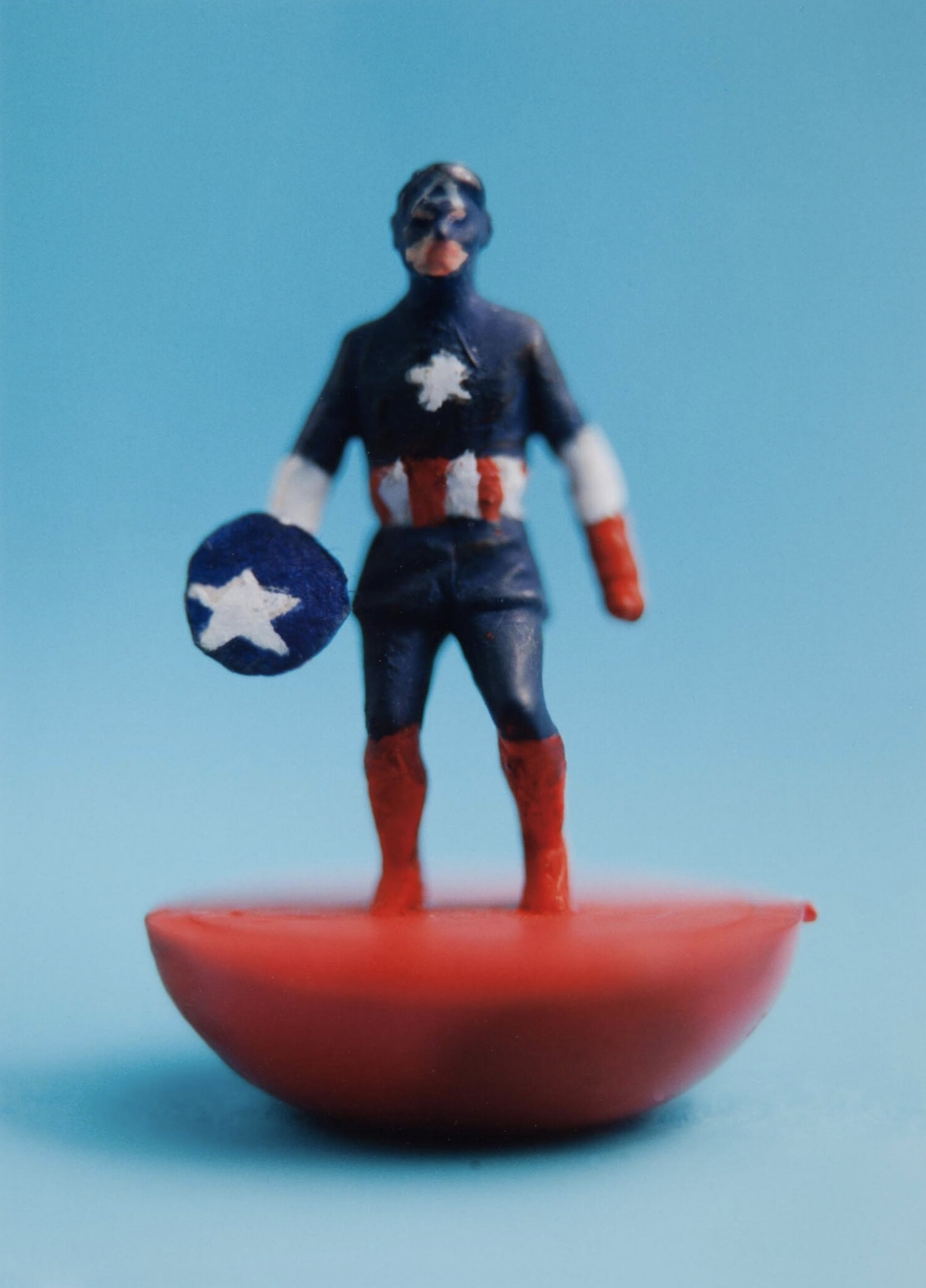
Football has been so popular that from the early days there were games based on the game. The oldest version of table football was manufactured in Preston in 1884. Then came blow football, Subbuteo and on through to today’s videogames. I enjoyed spotting a couple of photographs, by Julian Germain, of Superhero Subbuteo figures that were painted by BBH’s magnificent copywriter Nick Kidney. 

'Football is the ballet of the masses.’
Dmitri Shostakovich

I was particularly struck by the way that, over the years, design has moved football forward in small increments.

You can trace the development of shirt construction from collared flannelette to crewneck cotton to high tech elastane  - lightweight, breathable and sweat-wicking.

'In football everything is complicated by the presence of the opposite team.'
Jean-Paul Sartre

You can see how the design of footballs progressed: from heavy spheres made with an animal bladder wrapped in thick leather, to panelled balls with large seams. In 1931 the Argentine Superball, inflated using an air valve, dispensed with the leather lace, thus making it easier to head. 1974’s adidas Telstar, comprising 32 panels of white hexagons and black pentagons, was conceived to be more visible on TV. Subsequent balls, made with thermally bonded synthetic panels, have sought to deliver better boot contact and ‘truer flight.’

Note how new technology has changed the game itself, making it faster, more fluid and more skilful. Note too how in recent years marketing has moved the focus onto commercial optimisation. 

'I wouldn’t say I was the top manager in the business, but I would say I was in the top one.’
Brian Clough

Designing the new Brazilian kit. Courtesy of Felix Speller

Consider the evolution of the boot. 

The first footballers wore high-cut, leather work-shoes. By the 1880s players were nailing studs onto their soles to give secure footing on soft ground. Soon the footwear had reinforced toes and ankles. Manufacturers recognised the power of player endorsement to sell boots to a broader public. In the early 1900s MJ Rice & Son launched Steve Bloomer’s Lucky Goal Scorers. In the 1930s a lower cut, lighter boot, more suited to drier conditions and dribbling, was developed in southern Europe and South America. This ‘Continental’ style was adopted by Stanley Matthews, who in the early ‘50s promoted a pair for the mass market in collaboration with the Coop.

'We don’t want our players to be monks. We want them to be better football players, because a monk does not play football at this level.’
Bobby Robson

In 1952 the Puma Super Atom became the first boot with screw-in studs. West Germany were losing the 1954 World Cup Final 2-0 at half-time to favourites Hungary. Adi Dasler (the founder of adidas and brother of Puma founder Rudolf) suggested fitting the team’s boots with longer studs more appropriate to the rain-soaked conditions. West Germany went on to win 3-2 and the match was dubbed the ‘Miracle of Bern.’

'Football is a simple game. Twenty-two men chase a ball for 90 minutes and at the end the Germans always win.'
Gary Lineker

No. 2 Captain America aka Steve Rogers, Full Back. Figure by Nick Kidney / photo by Julian Germain

The 1968 Puma King featured a flexible sole and lightweight nylon screw studs. In 1970 Alan Ball wore boots painted white by Hummell, the first soccer footwear to be neither black nor brown. Subsequently, as pitch conditions improved and the need for protection diminished, boots were given lightweight kangaroo and textile uppers. There are now laceless models to enable a cleaner strike.

'Everything I know about morality and the obligations of men, I owe it to football.’
Albert Camus

It seems clear that football’s progress was driven by a combination of performance enhancement, scientific invention and commercial ingenuity. Marketing expanded the focus beyond the elite players on the pitch, to the broader playing community and indeed to non-playing spectators.

Design helped football and footballers play better, look better, earn better.

'Aim for the sky and you’ll hit the ceiling. Aim for the ceiling and you’ll stay on the floor.’
Bill Shankly

Of course, sometimes design and marketing have gone too far. Their voices have become too powerful. Too many unnecessary strips, unconvincing endorsements and uncalled for innovations have tested fans’ loyalty.

When the adidas Jabulani was introduced at the 2010 World Cup to a corporate fanfare, players complained that it had unpredictable movement. In 1995 the majority of Premier League club sponsors came from the technology and telecom sectors. In 2010 they came from financial services. By 2021 it was mostly betting. And when in 2013 Hull City's owners proposed changing the club's name to Hull City Tigers, supporters staged a protest with a banner proclaiming 'a club, not a brand.'

Designers and marketers need to remind themselves that, as Jock Stein said:

‘Football without fans is nothing.’


'In the marble halls of the charm school
How flair is punished.
Under marble Millichip, the FA broods
On how flair can be punished.
Their guest is a Euro-state magnate
Corporate-ulent.
How flair is punished.
Kicker, kicker conspiracy.
Kicker, kicker conspiracy.’

The Fall, ‘Kicker Conspiracy’ (M Smith)

No. 373

Don’t Be a Busy Fool: My Stressful Experience as a Debenhams Dishwasher

Kitchen Maid with the Supper at Emmaus, Diego Velasquez

Kitchen Maid with the Supper at Emmaus, Diego Velasquez

'It is not enough to be busy. So are the ants. The question is: What are we busy about?'
H D Thoreau

In my holidays from College I took a number of random jobs. I distributed law reports around Chancery Lane (beautiful buildings). I delivered the Christmas post around Romford (great canteen). I dug holes in Harold Hill (excellent for sun tan and body tone). And I did a fair amount of filing - which was a major occupation in the pre-digital age (not good for anything really, other than mind control).

My most stressful employment was in the kitchens of the Debenhams Department Store in Romford Town Centre.

I was stationed on my own alongside some large stainless steel sinks and industrial dishwashers. A conveyer belt brought me dirty crockery, cutlery and glasses in a steady stream from the adjacent customer restaurant. All I had to do was sort and stack the items as they came through.

The problem was that I had no control of the speed of the conveyer belt or the volume of the dishes. And I couldn’t prevent myself pausing occasionally to finish off an attractive unwanted pastry. 

As the lunchtime rush accelerated, I struggled to keep up. Pots and plates, mugs and jugs, saucers, soup bowls and serving spoons presented themselves to me in an ever more confused, messy muddle. I piled and loaded with diminishing care and increasing anxiety, spilling gravy on the floor, dropping the occasional glass. I became somewhat flustered, which hampered me even more. 

And the conveyor belt kept on rolling. And the dirty dishes kept on arriving, unrelenting, unforgiving. 

It all got a bit too much. I shouted through the plastic flap to the restaurant, begging the nearby waiters to slow things down. But they carried on regardless, pacing the floor in a catatonic stupor.

I read somewhere once that stress derives in large part from lack of control. The problem is out of our hands, beyond our ability. There’s nothing we can do. Well, dishwashing at Debenhams was the very definition of a stressful occupation.

Eventually, as lunch turned towards afternoon tea, the volume of crockery declined and I recovered my composure. 

I helped myself to one last custard tart.

President Dwight Eisenhower made a celebrated distinction regarding the challenges he faced in office (quoting Dr J R Miller, president of Northwestern University):

'I have two kinds of problems: the urgent and the important. The urgent are not important, and the important are never urgent.’ 

This sentiment should resonate with many people in modern business. We know that we should really be applying ourselves to the big long-term issues that loom on the horizon. But we just can’t quite get around to them, because pressing short-term problems keep demanding our attention.

The truth is that some of these short-term concerns are not as urgent as they may seem. They’re a distraction, and they should probably be dealt with by someone else. Indeed a few of them may be entirely superfluous. What’s more, some of those long-term issues really need to be addressed right now. 

'Nothing is less productive than to make more efficient what should not be done at all.'
Peter Drucker

Smart business people learn to concentrate on the urgent issues that are really important, and the important issues that are actually urgent. They have the ability to differentiate and delegate, categorise and schedule. Prioritisation of tasks and challenges is a critical skill in life and business.

'Being busy does not always mean real work. The object of all work is production or accomplishment, and to either of these ends there must be forethought, system, planning, intelligence, and honest purpose, as well as perspiration. Seeming to do is not doing.'
Thomas Edison

Gwyn and I left BBH at the same time, and we both embarked on a stage in our careers that is more plural in nature. BBH Founder John Bartle, wary of the pitfalls of such a path, offered Gwyn the following concise advice: ‘Don’t be a busy fool.’


'Got to have a job to put the food on the table.
Got to have a job to keep that party able.
Got to have a job to bring home the bread.
Got to have a job to keep that family fed.

Sometimes your business is all messed up.
Sometimes you don't have your thing together.
And when your thing is all messed up,
Somebody will take that fire, yeah!
So, if you don't give a doggone about it,
If you don't give a doggone about it,
Then they—
They won't give a damn!’

James Brown, 'If You Don't Give A Doggone About It'

No. 317

About Time

cri_000000386470-1.jpg

'Sed fugit interea, fugit irreparabile tempus.' 
(Meanwhile time flies; it flies never to return.)
Virgil, Georgics 

I recently visited Christian Marclay’s splendid installation at the Tate Modern in London: ‘The Clock 2010’ (until 20 January).

Marclay and his team of researchers spent several years collecting excerpts from famous and lesser-known films that feature clocks, watches and other timepieces. He then edited these clips together so that they show the actual time. The final artwork, viewed in a cinema setting, is 24-hours long and contains around 12,000 different movie moments.

At about 10-40 AM Hugh Grant is woken by multiple alarms; Gary Cooper looks apprehensively at a wall clock; Humphrey Bogart rouses a sleeping Gloria Grahame; Adam Sandler suggests there’s still time for a McDonald's Breakfast. We skip seamlessly through time references in ‘Clockwise’, ‘Columbo’ and ‘Catch Me If You Can’; ‘The Talented Mister Ripley’, ‘Twin Peaks’ and ‘Three Colours: Blue.’ We see church clocks, railway clocks, grandfather clocks; wrist watches and pocket watches; sundials, hourglasses and microwave LEDs. We hear chimes, peals, beeps and ticks. We observe conversations about time; dramas around deadlines.

We find ourselves enthralled, spotting the film references, amused by the editor’s choices. We want to follow particular sequences longer. But we can’t. Time and the edit march on.

Collage courtesy: https://journalofseeing.wordpress.com/2011/11/01/high-noon-clocks/

Collage courtesy: https://journalofseeing.wordpress.com/2011/11/01/high-noon-clocks/

At around 5-00 PM Jack Nicholson leaves work for the very last time; Robert Redford hits a home run and the ball shatters the stadium clock; Clint Eastwood observes a gunfight between Lee Van Cleef and Gian Maria Volonte.

Since the source material of ‘The Clock’ comes from the world of cinema, there’s a heightened sense of drama: an urgency as heists are planned, trains are delayed, deadlines loom. We arrive early for an appointment, late for a conference. Time is elastic. It slows down as the meeting drags on, as the boredom sets in; and then speeds up as the alarm goes off, the gun is fired.

At this precise moment, somewhere in the world babies are being born, promises are being made, crimes are being committed, hearts are being broken. We are struck by the sense that our complex, fragmentary existence is unified by the ticking clock. Time is the ever-present adhesive that holds it all together, the harness that keeps us in step. Time is sometimes a silent witness. Sometimes it is a catalyst, an actor in events. It can be relentless, oppressive, unforgiving.

‘The Clock is very much about death in a way. It is a memento mori.’
Christian Marclay

The creative industry has often had an uncomfortable relationship with time. We feel constrained by schedules, intimidated by deadlines. We balk at timetables and Gantt charts. We hesitate and delay, postpone and prevaricate. We always want more time.

'Time is what we want most, but what we use worst.’
William Penn

It doesn’t have to be this way.

BBH was famous for the creativity of its output, but many were surprised at its passion for process. We loved schedules, progress reports and status meetings; reviews and timing plans; project and traffic management. Indeed one of the Agency’s core beliefs was ‘processes that liberate creativity’.

I have always liked this phrase. It suggests that if we embrace the discipline of planning and preparation, if we properly plot the priority and sequence of tasks, time can become an ally to ideas, not an enemy. We shouldn’t be working all hours; we should be making all hours work for us. With proper forethought, it’s possible to make time, not waste it.

'The great dividing line between success and failure can be expressed in five words: “I did not have time."'
Franklin Field

'Time takes a cigarette, puts it in your mouth.
You pull on your finger, then another finger, then your cigarette.
The wall-to-wall is calling, it lingers, then you forget.
Oh oh, you're a rock 'n' roll suicide.’

 David Bowie, ‘Rock 'n' Roll Suicide'

No. 213

501! Contemporary Lessons from a Vintage Case Study

Levis Ad - BBH

Levis Ad - BBH

During my twenty-five years in advertising, I worked on all manner of client businesses. From banks and beers, to fried chicken and phone networks. Without doubt the experiences that left the deepest impression, and had the biggest impact on my career, were those that I gained on the Levi’s jeans account in the 1990s.

Between 1985 and 1998 Levi’s campaign for its 501 jeans, developed by its agency BBH, was one of the most awarded and admired in the advertising world. It created a mythical America of enigmatic, unspeaking heroes; of youthful adventure on the open road; of effortless style and heart-rending tunes. And it sold a great many pairs of jeans.

Let’s take a step back in time to see if this vintage case study suggests any lessons that might still be relevant today.

‘Be Yourself. Everyone else is already taken.’
Oscar Wilde

At the heart of the Levi’s 501 story was the determination that it should be true to itself.

Levi’s 501 was the original denim jean. It was designed in 1873 for miners in the California Gold Rush. Its riveted construction, button fly and XX stitching sustained it through tough manual tasks. Its rudimentary ‘anti-fit’ cut was appropriate to its modest origins. It was the jean that was adopted in the ‘50s by the likes of Marlon Brando, James Dean and Eddie Cochrane, and thereby became a badge of youth rebellion. It had a unique heritage to be proud of.

However, when in 1985 Levi’s struggling UK organisation submitted the 501 to consumer testing with a view to a possible re-launch, the results were not encouraging. Modern British consumers were more accustomed to zip flies and figure-hugging fits. The Levi’s brand was perceived as middle-aged and middle-of-the-road. What’s more, Levi’s was quintessentially American at a time when UK youth culture was not looking across the pond for inspiration.

The sensible decision might have been to back away. Or at least to launch a style more in keeping with contemporary tastes.

But Levi’s and BBH were determined. This was the original and definitive jean, the blueprint for everything that followed. It was a design classic. It deserved a hearing.

Fanning the Flames of Discovery

There was a glimmer of encouragement. A small group of cognoscenti in the fashion, music and film industries had already fallen for the 501’s authenticity and unique design. There was a growing interest in retro ‘50s culture, and a thriving second-hand market in 501s from the States. Perhaps, by reflecting what these enthusiasts loved so much about the product, there was an opportunity to fan the flames of discovery.

A Simple Story Stylishly Told

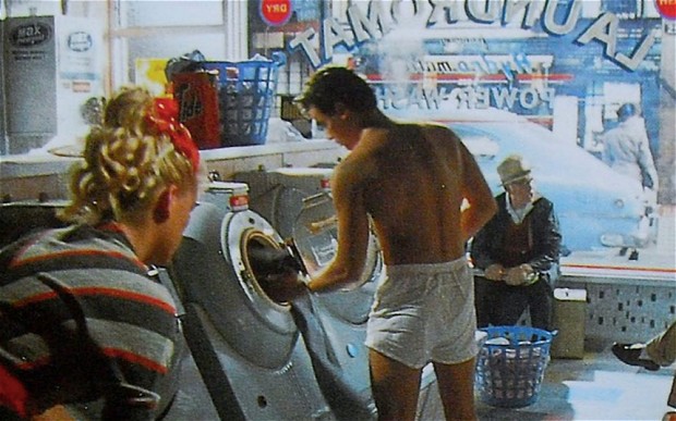
A young man walks into a laundrette to the sound of ‘I Heard It Through the Grapevine.’ He removes his jeans and t-shirt and puts them in the washer with some stones. He sits down to read a magazine in his boxer shorts and socks, as others look on in amazement.

With a 1985 TV commercial conveying this modest narrative, Levi’s 501 jeans were introduced to the mass British public. Despite its seeming simplicity, ‘Laundrette’ was an immediate cultural and commercial hit. It was discussed in national media. The music entered the charts. Nick Kamen, the actor playing the central character, became an overnight celebrity. Boxer shorts were suddenly fashionable, with two million pairs being bought in 1986 alone. And 501 jeans sold so quickly that demand outstripped supply.

There followed a series of similarly iconic commercials, all depicting youthful heroes in pursuit of their own American dream, equipped with little more than their 501s, a white t-shirt and an innate resourcefulness. Within three years of the re-launch, 501 sales had increased twenty-fold - at a premium price of between £27 and £30, in a market where the norm was sub-£20.

Levi’s succeeded because it didn’t follow the convention of the time and hold a mirror up to consumer tastes and preferences. Rather it shone a light on the brand and its unique story. It sought to persuade consumers of its merits, with a simple story stylishly told.

‘What the heart knows today, the head will understand tomorrow.’
James Stephens

Although Levi’s campaign was inspired by its heritage, it was not an exercise in dry historical narrative. First and foremost the advertising addressed the emotions. It suggested charismatic youth, heroic nonchalance and potent sexual chemistry. It promised freedom, escape, romance and rebellion.

Stripped of spoken words, the ads conveyed all this through compelling storytelling, impactful imagery and emotive music. As John Hegarty, the creative director behind it all, pointed out, ‘words are a barrier to communication.’

Emotional Product Demonstration

Despite the fact that the initial persuasive power of the campaign was emotional, it was also clear that consumers wanted rational reasons to justify their beliefs - to others and to themselves.

So amidst the stylish settings, slim heroes and sensuous music, the commercials always demonstrated the jeans’ functional attributes: their strength, durability and wear characteristics. 501s personalised with age and improved with wear. And the more you washed them, the better they got.

Creative teams found that such stories were excellent springboards for lateral ideas.  And Hegarty dubbed this advertising approach ‘emotional product demonstration.’

Mass Marketing a Cult

From the outset there was some concern that, in broadening the appeal of a product originally beloved by a small group of cognoscenti, the brand would lose that critical group’s support. What if our opinion leaders sought exclusivity elsewhere? Wouldn’t this undermine the whole endeavour?

BBH determined that it was critical to sustain a relationship with opinion leaders. It developed print advertising that directly addressed them in their own discrete magazine titles (publications like The Face, iD and Dazed & Confused). It sponsored cutting edge bands and grass roots music events. And it offered Shrink-to-Fit and limited editions of the core product - something the cognoscenti could call their own.

The lesson was clear: never forget the people that first loved you.

‘Creek’ 1994 - BBH

‘Creek’ 1994 - BBH

United in Dreams, Divided by Realities

Levi’s soon looked to export the UK’s successful marketing to other European markets. This ought to have been challenging: back in the 1980s few campaigns crossed borders because local cultural differences were thought to be too great.

But BBH found that, though young people might be divided by the realities of their everyday circumstances, they were united in their dreams. The 501 campaign worked wherever the local youth aspired to independence and individuality; to original expression and the open road.

By the mid-1990s Levi’s was selling 50 million units per annum across Europe – and always at a premium price.

‘Move it on without moving it off.’
Nigel Bogle

With every new execution in the campaign, the pressure grew to sustain freshness and interest. How do you avoid predictability and familiarity? How do you avoid losing the baby with the bathwater?

The advertising struck a balance. It retained its chassis: the narrative structure; the aspirational hero; the dramatisation of product functionality. And at the same time it underwent constant restyling in its bodywork: the setting; the historical period; the tone; the filmic style; the particular product story.

Over the years 501 commercials were set in pool halls, drug stores and gas stations; in swimming pools, creeks and under the sea; in black & white, colour and animation; in the nineteenth century, the Depression and in outer space.

As BBH co-founder Nigel Bogle summarised: ‘We need to move it on without moving it off.’

Perhaps inevitably, the Levi’s 501 campaign did eventually run out of road. There was only so long that one brand could sustain mass loyalty to a single product in the fickle fashion category; only so long that the brand’s innovation could be primarily supplied by its marketing rather than by its product; and only so long that that brand could continue to grow volume and premium at the same time. Eventually the centre could not hold, and the market fragmented.

But it had been a pretty good run.

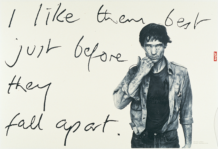
Levi’s print ad - Richard Avedon for BBH

Levi’s print ad - Richard Avedon for BBH

So what did I learn from working on this great, but now long-gone, advertising campaign? I picked up a number of lessons about the fundamentals of persuasion that served me well for the rest of my career:

1. Don’t seek to add value, seek to reveal it.
2. Harness the support that you already have: fan the flames of discovery.
3. Embrace the power of narrative: simple stories stylishly told.
4. Lead with emotion: what the heart feels today, the head thinks tomorrow.
5. However much beliefs may be founded on emotion, give people rational justifications for those beliefs.
6. Never forget the people that first loved you.
7. Find the aspirations that unify people, rather than the realities that divide them.
8. Keep moving it on without moving it off.

Of course, today we live in an ever more complex, interconnected, fast-paced world. The landscape of marketing and communication is unrecognisable from the more innocent times of the late ‘80s and ‘90s. But I think many of these themes still resonate. And perhaps like 501s themselves, they improve with age.


(This piece first appeared in The Pembrokian, July 2018)

No. 200

Articulate Anger: Why Slogans Matter

2017 Washington Women’s March

2017 Washington Women’s March

I recently attended an exhibition reviewing the relationship between graphics and politics over the last ten years.

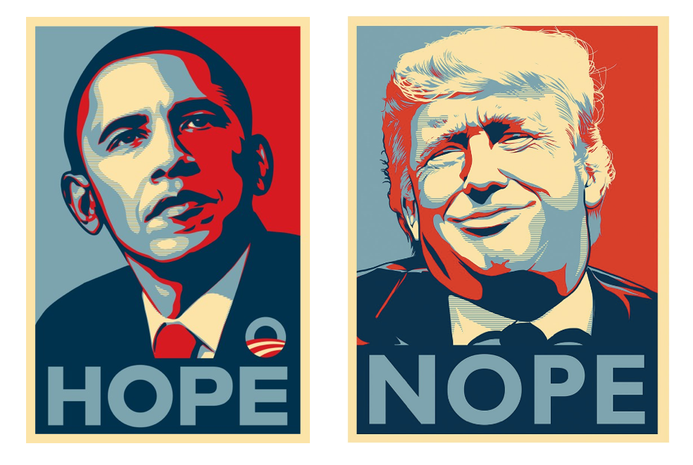
‘Hope to Nope’ (The Design Museum, London, until 12 August) considers various political and protest movements in the decade since Shepard Fairey’s famous 2008 ‘Hope’ poster in support of Barack Obama’s Presidential bid. It displays banners, posters and memes; stunts, symbols and slogans; from Occupy and Deepwater Horizon, to Taksim Square and Charlie Hebdo; from Brexit and the 2016 US election, to women’s marches and Black Lives Matter… and more besides.

We live in turbulent times.

Screen-Shot-2018-04-23-at-09.17.38.png


You can’t help but be impressed by the lucidity, wit and invention of many of the pieces. You can see earnest Soviet posters subverted to include rainbow Pride colours; playful Jeremy Corbyn emojis; sinister Guy Fawkes masks; an ominous Trump fortune teller. In Hong Kong in 2014 protestors collectively adopted umbrellas, initially to shield themselves from the sun, and subsequently from tear gas. In Sao Paolo in 2015/16 marchers against tax rises and government corruption rallied to the theme of ‘I will not pay the duck.’ ‘Pay the duck’ means take the blame for something that is not your fault.

Often the material harnesses serious political messages to popular culture. After the Trump election victory, a Star Wars Rogue One poster became Rogue Won. And my former Agency BBH collaborated with the community action group Justice4Grenfell in a piece that referenced the movie ‘Three Billboards Outside Ebbing Missouri’:  ‘71 Dead…And still no arrests…How come?’

tres-anuncios-grenfell3.jpg

The exhibition also offers a compelling selection of funny, smart and eloquent political slogans. Consider the following from various anti-Trump rallies:

‘Love trumps hate.’
‘Make love not walls.’
‘This pussy grabs back.’
‘I can’t believe I still have to protest this shit.’
‘A woman’s place is in the White House.’
‘Sexism is not sexy.’
And my personal favourite:
‘We shall overcomb.’

Of course, the language of protest has been familiar to us for many years. But in the digital age the impact of traditional approaches has been amplified by social media, memes and hashtags. Campaigns are easier than ever to initiate, endorse, adapt, share and spoof.

It’s therefore become more difficult than ever to cut through. Shepard Fairey expresses the challenge thus:

‘People have a lot of visual noise in their lives, so my work needs to be instant and memorable, easy to replicate and, even in an analogue world, potentially viral. Digital tools and social media mean that more people are empowered, but there are also white noise and mediocre graphics and memes bouncing around. I utilise the same principles that I always have when I transmit my work digitally: I want to be instantly memorable, evocative, and graphically and emotionally potent.’

As I wandered around the museum, I found myself wondering why the best rallying cries seem so compelling; why it is helpful to condense complex issues into catchy rhymes and phrases. Why do slogans matter?

Many years ago a girlfriend left me. I became depressed, inert, isolated. But more particularly I found I was completely inarticulate about how I felt. I couldn’t explain what had happened, why she’d gone, what I’d done to deserve this.

I took to going running round a local park. And as I ran I gradually pieced together in my head a narrative about what had gone wrong. I composed the speech I would deliver if I ever saw her again. And with every passing day and every exhausting circuit, the oration grew in clarity, brevity and articulacy.

Then, at last, my speech was perfect, crisp and concise. And I realised at that moment that I didn’t need to make it. I had moved on. I wouldn’t have to run round that muddy park again either.

‘The more acute the experience, the less articulate its expression.’

Harold Pinter

Some experiences are so intense, emotional, complex and confusing that we feel only unfocused anger, foggy regret, dim despair. We become powerless, helpless, listless.

It’s only when we can distil our feelings into words and phrases – when we can articulate our anger - that we can begin to recover and become capable of action.

Like any well-crafted copy, the best political slogans define how we feel about an issue; compress it into something clear, precise and strong; find fellow feeling with others; and motivate us to get out and do something about it.

But there are limits to what graphics and slogans can achieve. After an hour at the exhibition, having walked through an aggregation of witty words, angry sentiments and cool design, I began to worry that mass protest is becoming almost effortless in the social era. It’s just a little too easy to like and retweet; to post and hashtag; to endorse, sign up and send on.

In 2017 the artists’ street project flyingleaps published the following statement on UK poster sites:

‘Slogans in nice typefaces won’t save the human races.’

It’s a valid caveat: a political slogan is only as good as its power to prompt action. This is a sentiment that the Suffragettes had elegantly expressed over a century before:

‘Deeds not words.’


(This piece first appeared on BBH Labs on 23 April 2018.)


No. 180


The Hall of Mirrors: Should Advertising Offer Consumers Reflections of Themselves?

rita-hayworth-lady-from-shanghai.png

‘When I start out to make a fool of myself, there's very little can stop me. If I'd known where it would end, I'd never let anything start.’

Orson Welles, ’The Lady from Shanghai’

The 1947 movie classic ‘The Lady from Shanghai’ features an Irish Orson Welles caught up in a web of deceit woven by wealthy lawyer Everett Sloane and his wife, a curiously blonde Rita Hayworth.

The climax of the film takes place in a deserted amusement park, The Crazy House. ‘Stand up or give up,’ the arcade posters proclaim. In the Hall of Mirrors the three lead characters confront each other and a multiplicity of their own images and impressions. Neither they nor the audience can discern the real people from their reflections. Truth and falsehood are intertwined. It’s a cinematic tour de force.

When I first joined BBH in the early 1990s I was warned against ‘holding a mirror up to consumers.’ It was suggested that this is a lazy approach for any advertiser to take. ‘Holding a mirror up’ assumes that people enjoy seeing their own behaviours, attitudes, tastes and styles reflected back at them in brand communication; that they like to look at approximations of themselves in advertising; that brands are rewarded for acute observation of people’s musical preferences, fashion choices and figures of speech.

But who wants to encounter counterfeit copies of themselves? Who wants to be regarded as a type or category; to see their private codes and language broadcast for all to share?

So we took a different path. We preferred to shine a light on the brand; to let it present its best self to the world. We liked to let the brand speak.

Looking back on this position in the midst of the social media age, I can’t help wondering whether we were wrong all along. As is widely observed, nowadays we all inhabit echo chambers of our opinions, prejudices and world-views. We live in a Hall of Mirrors of our own making, endlessly self-publishing; craving affirmation and approval; seeking endorsement of how we look, what we do, what we feel, what we think; freely surrendering our personal data in our relentless quest for recognition and validation.

And consequently much of modern advertising pursues the ‘hold the mirror up to consumers’ approach. Our screens are filled with elegantly aspirational metropolitan executives, charmingly chaotic suburban families, fun-loving bobble-hatted youths.

I nonetheless find it difficult to recant. I remain convinced that brands have a responsibility to stand for something; that there is more integrity in selling than there is in pretending to share values, hopes and dreams; that rather than just reflecting consumers’ attitudes, we should seek to change them.

Despite all the evidence to the contrary, I doubt people will be seduced by this Hall of Mirrors for too long. Ultimately Narcissus’s infatuation with his own image destroyed him.

Back in the Crazy House, Sloane wearily directs his pistol at Hayward.

‘Of course, killing you is killing myself. But, you know, I'm pretty tired of both of us.’

In the shootout that follows, chaos and confusion reign. The mirrors shatter. The glass cascades in crystals all around.

No. 174