Designing the Beautiful Game: Play Better, Look Better, Earn Better

Photo credit: Puma archive

'Behind every kick of a ball, there has to be a thought.’
Denis Bergkamp

I recently visited an excellent exhibition exploring the role of design in the development of football. (‘Football: Designing the Beautiful Game’ is at the Design Museum, London until 29 August.)

On entering the gallery you encounter a Zambian ball made from a maize meal sack tied with string. It serves to reinforce the simplicity of the game that has made it so broadly popular.

'One of the reasons football is the most popular sport in the world is because the weak can beat the powerful.’
Marcelo Bielsa

You can see displays of historic balls, boots, banners and badges; archaic shinpads, pumps and goalkeepers’ gloves; the Acme Thunderer, the world’s original sport whistle, invented by a Birmingham toolmaker in 1884.

You can admire George Best’s first pair of boots – on the sides, in neat white painted letters, he recorded the games in which he scored. You can marvel at number 10 shirts worn by Platini, Messi, Zico and Maradonna.

'It’s true I don’t know much about the players here, but they definitely know who I am.’
Zlatan Ibrahimovic (on joining PSG in 2012.)

You can learn that the iconic Brazilian strip, incorporating the four colours of the national flag, was designed by an 18 year old newspaper illustrator. He was responding to a competition after the humiliating loss to Uruguay in the 1950 World Cup Final, when the team wore an all-white kit.

You can observe design’s impact beyond the pitch: from a rudimentary rattle to the reviled vuvuzela horn; from promotional posters to match day programmes and fanzines. There’s Coventry’s splendid Sky Blue programme, which won a D&AD prize in 1972. There are displays about innovative stadium architecture: the San Siro, the Allianz Arena, Tottenham Hotspur and Forest Green Rovers. 

I noted with a pang of melancholy that Spurs’ sophisticated acoustic modelling has not been applied at West Ham’s London Stadium. Indeed, as far as I could see, the Hammers’ main contribution to the exhibition was a hooligan calling card…

One of the two match balls used in the 1930 World Cup final, supplied by Argentina and used in the first half. Credit: Neville Evans Collection

'Before you can coach others, you must learn to coach yourself.’
Johan Cruyff

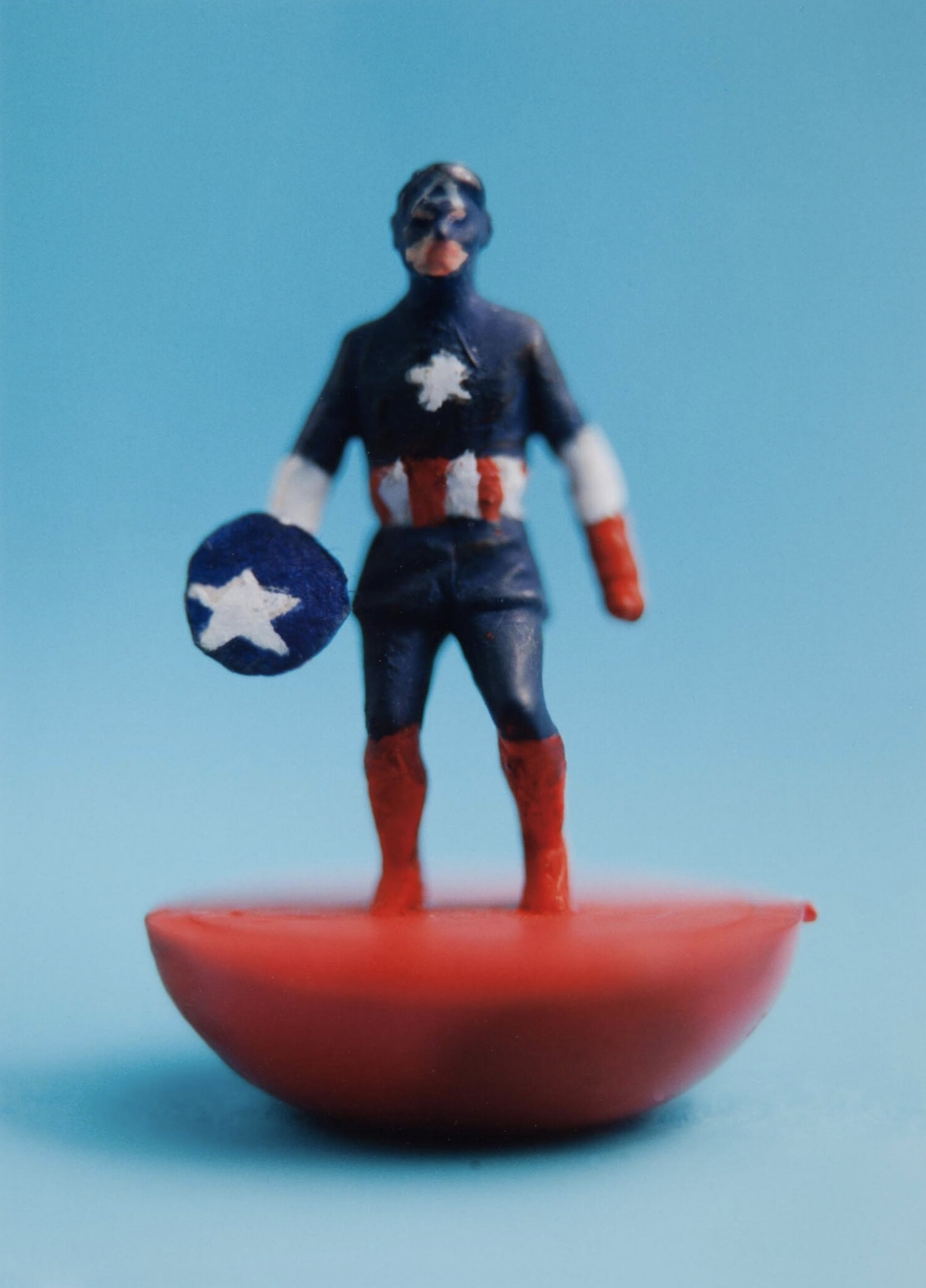
Football has been so popular that from the early days there were games based on the game. The oldest version of table football was manufactured in Preston in 1884. Then came blow football, Subbuteo and on through to today’s videogames. I enjoyed spotting a couple of photographs, by Julian Germain, of Superhero Subbuteo figures that were painted by BBH’s magnificent copywriter Nick Kidney. 

'Football is the ballet of the masses.’
Dmitri Shostakovich

I was particularly struck by the way that, over the years, design has moved football forward in small increments.

You can trace the development of shirt construction from collared flannelette to crewneck cotton to high tech elastane  - lightweight, breathable and sweat-wicking.

'In football everything is complicated by the presence of the opposite team.'
Jean-Paul Sartre

You can see how the design of footballs progressed: from heavy spheres made with an animal bladder wrapped in thick leather, to panelled balls with large seams. In 1931 the Argentine Superball, inflated using an air valve, dispensed with the leather lace, thus making it easier to head. 1974’s adidas Telstar, comprising 32 panels of white hexagons and black pentagons, was conceived to be more visible on TV. Subsequent balls, made with thermally bonded synthetic panels, have sought to deliver better boot contact and ‘truer flight.’

Note how new technology has changed the game itself, making it faster, more fluid and more skilful. Note too how in recent years marketing has moved the focus onto commercial optimisation. 

'I wouldn’t say I was the top manager in the business, but I would say I was in the top one.’
Brian Clough

Designing the new Brazilian kit. Courtesy of Felix Speller

Consider the evolution of the boot. 

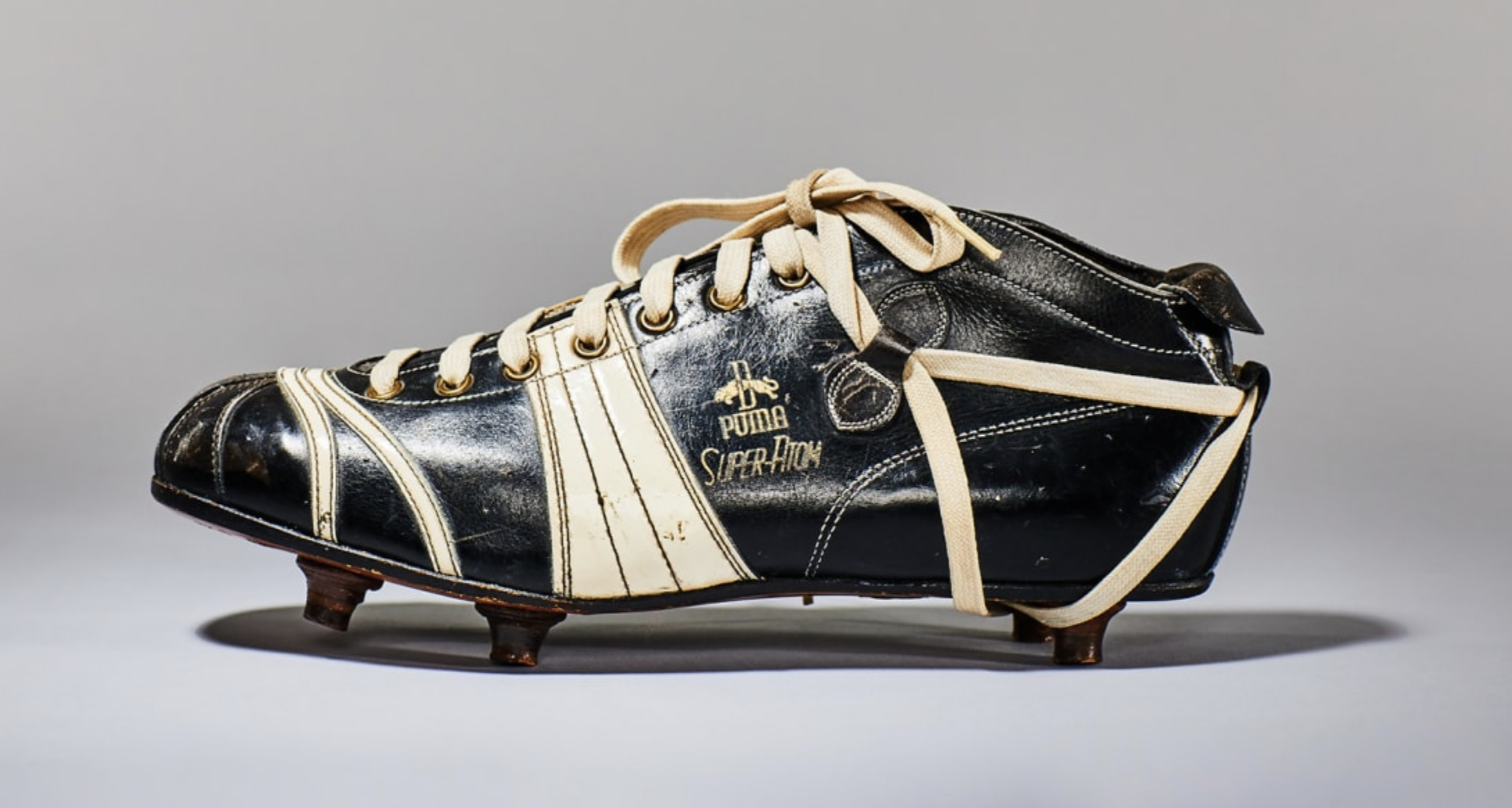
The first footballers wore high-cut, leather work-shoes. By the 1880s players were nailing studs onto their soles to give secure footing on soft ground. Soon the footwear had reinforced toes and ankles. Manufacturers recognised the power of player endorsement to sell boots to a broader public. In the early 1900s MJ Rice & Son launched Steve Bloomer’s Lucky Goal Scorers. In the 1930s a lower cut, lighter boot, more suited to drier conditions and dribbling, was developed in southern Europe and South America. This ‘Continental’ style was adopted by Stanley Matthews, who in the early ‘50s promoted a pair for the mass market in collaboration with the Coop.

'We don’t want our players to be monks. We want them to be better football players, because a monk does not play football at this level.’
Bobby Robson

In 1952 the Puma Super Atom became the first boot with screw-in studs. West Germany were losing the 1954 World Cup Final 2-0 at half-time to favourites Hungary. Adi Dasler (the founder of adidas and brother of Puma founder Rudolf) suggested fitting the team’s boots with longer studs more appropriate to the rain-soaked conditions. West Germany went on to win 3-2 and the match was dubbed the ‘Miracle of Bern.’

'Football is a simple game. Twenty-two men chase a ball for 90 minutes and at the end the Germans always win.'
Gary Lineker

No. 2 Captain America aka Steve Rogers, Full Back. Figure by Nick Kidney / photo by Julian Germain

The 1968 Puma King featured a flexible sole and lightweight nylon screw studs. In 1970 Alan Ball wore boots painted white by Hummell, the first soccer footwear to be neither black nor brown. Subsequently, as pitch conditions improved and the need for protection diminished, boots were given lightweight kangaroo and textile uppers. There are now laceless models to enable a cleaner strike.

'Everything I know about morality and the obligations of men, I owe it to football.’
Albert Camus

It seems clear that football’s progress was driven by a combination of performance enhancement, scientific invention and commercial ingenuity. Marketing expanded the focus beyond the elite players on the pitch, to the broader playing community and indeed to non-playing spectators.

Design helped football and footballers play better, look better, earn better.

'Aim for the sky and you’ll hit the ceiling. Aim for the ceiling and you’ll stay on the floor.’
Bill Shankly

Of course, sometimes design and marketing have gone too far. Their voices have become too powerful. Too many unnecessary strips, unconvincing endorsements and uncalled for innovations have tested fans’ loyalty.

When the adidas Jabulani was introduced at the 2010 World Cup to a corporate fanfare, players complained that it had unpredictable movement. In 1995 the majority of Premier League club sponsors came from the technology and telecom sectors. In 2010 they came from financial services. By 2021 it was mostly betting. And when in 2013 Hull City's owners proposed changing the club's name to Hull City Tigers, supporters staged a protest with a banner proclaiming 'a club, not a brand.'

Designers and marketers need to remind themselves that, as Jock Stein said:

‘Football without fans is nothing.’


'In the marble halls of the charm school
How flair is punished.
Under marble Millichip, the FA broods
On how flair can be punished.
Their guest is a Euro-state magnate
Corporate-ulent.
How flair is punished.
Kicker, kicker conspiracy.
Kicker, kicker conspiracy.’

The Fall, ‘Kicker Conspiracy’ (M Smith)

No. 373
Charlotte Perriand: ‘The Art of Living’

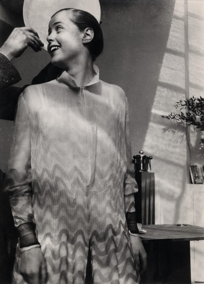
Charlotte Perriand in her studio on place Saint-Sulpice, Paris, 1928. The hands holding a plate halolike behind her head are Le Corbusier’s. Photo: Archives Charlotte Perriand

Charlotte Perriand in her studio on place Saint-Sulpice, Paris, 1928. The hands holding a plate halolike behind her head are Le Corbusier’s. Photo: Archives Charlotte Perriand

'The extension of the art of dwelling is the art of living.’
Charlotte Perriand

I recently visited an excellent exhibition of the work of designer Charlotte Perriand (The Design Museum, London until 5 September).

Perriand applied modernist principles to furniture design. She didn’t decorate a room, she equipped it for living. Her furniture addressed fundamental human needs and desires. Her interiors embraced space, light and flexibility. And she recognised the huge importance of storage. Critically, with experience she evolved her approach: she learned from her travels; she synthesised traditional craftsmanship with industrial production. She responded to ‘transient times.’

'Dwellings should be designed not only to satisfy material specifications; they should also create conditions that foster harmonious balance and spiritual freedom in people’s lives.'

Here are some lessons derived from Perriand’s full and fascinating life.

1. Better Design Creates a Better Society

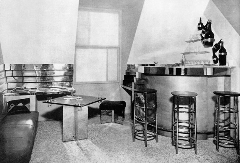
Born in Paris in 1903 to a tailor and a seamstress, Perriand studied furniture design at the École de L'Union Centrale des Arts Décoratifs. Two years after graduating, she renovated her loft apartment, turning it into a compact modernist dream. Her Bar sous le Toit (‘Bar under the roof’) had a built-in cocktail-bar of aluminium and glass, with nickel-plated copper stools; a chrome-plated table with a fitted gramophone; a leather banquette.

In 1927 Perriand applied to work at the studio of modernist architect Le Corbusier. She was rudely rejected.

‘We don't embroider cushions here.’

A month later however, Le Corbusier saw a recreation of Perriand’s Bar sous le Toit at an exhibition, and promptly offered her a job in furniture design.

Bar sous le Toit (‘Bar under the roof’)

Bar sous le Toit (‘Bar under the roof’)

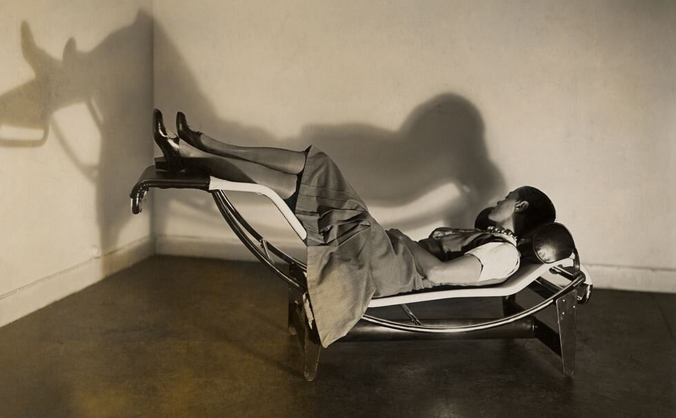
Working alongside Le Corbusier and his cousin Pierre Jeanneret, Perriand designed three chairs for three different tasks - all employing highly functional tubular steel: the Fauteuil au dos basculant, a light chair with canvas back and seat, ideal for conversation; the Fauteuil grand confort, an easy chair with square leather cushions, for relaxation; and the Chaise longue, a futurist machine for sleeping. They all became classics.

Perriand imagined that her tubular steel furniture could be mass-produced by Peugeot, the bike manufacturer. They didn’t quite share her vision.

'Our attempts at talks with the Peugeot bicycle company resulted in half an hour of total incomprehension.'

Perriand believed that better design helped create a better society. She worked with modern materials in bold colours; experimented with movable, foldable functionality; valued space, fresh air and light. 

‘Hygiene must be considered first: soap and water. 
Tidyness: standard cupboards with partitions for these.
Rest: resting machines for ease and pleasant repose.’
The Studio, 1929

There are a number of photographs of Perriand around this time. She sports a close-cropped bob, wears a dress with a bold print and a self-made necklace of industrial ball-bearings. She looks confident, playful, thoroughly contemporary.

2. ‘Adapt to Transient Times’

'Everything changes so quickly, and what is state-of-the-art one moment won’t be the next. Adaptation has to be ongoing – we have to know and accept this. These are transient times.'

In the 1930s Perriand was heavily involved with left-wing politics. To this end she designed a dwelling for low-income families for which each individual was allocated 14 square metres. And as the modernist machine aesthetic became increasingly associated with militarism - cold and inhumane - so she set aside expensive chrome. Instead she embraced natural forms and handcrafted techniques; affordable materials that could be mass produced and easily constructed. 

On weekend expeditions with friends to the Normandy beaches Perriand took inspiration from found objects. 

'We would fill our backpacks with treasures: pebbles, bits of shoes, lumps of wood riddled with holes, horsehair brushes—all smoothed and ennobled by the sea.’

Perriand on the chaise longue

Perriand on the chaise longue

3. ‘Choose Life’

At the exhibition you can see Perriand’s notebooks and plans. She began designing her chairs by reviewing current models and then she explored what was possible from first principles. Her sketched ideas were detailed, vibrant and thoughtful. When she worked on a building, she spent time visiting the site alone, absorbing its natural qualities. 

'In every important decision there is one option that represents life, and that is what you must choose...Life is something in motion.’

4. ‘Better to Spend a Day in the Sun than to Spend it Dusting our Useless Objects’

Le Corbusier had not given Perriand due credit for her designs and, after working with him for a decade, she ‘stepped out of his shadow.’

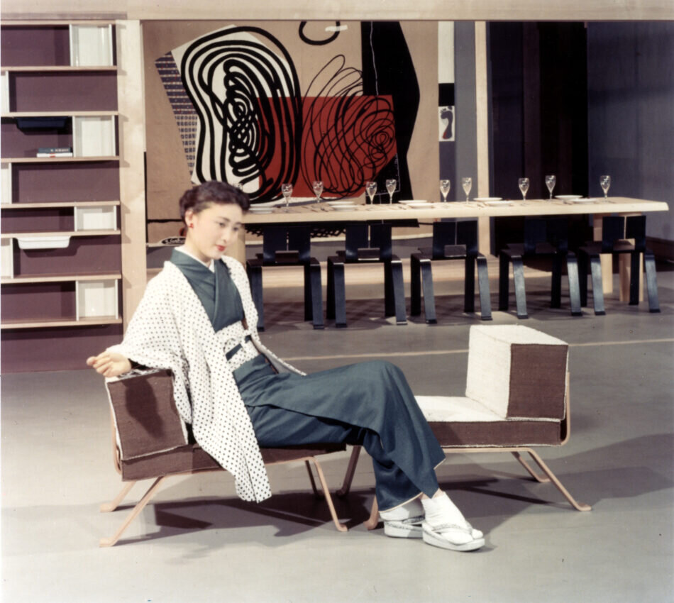
In 1940 she travelled to Japan (before it entered the War) as an official advisor for industrial design. She fell in love with the country’s open, flexible interiors; with their simplicity, harmony and emptiness.

As a result, Perriand developed a fascination with storage. She determined that an ordered environment decreased anxiety and increased quality of life.

'What is the crucial element in domestic equipment? We can answer that immediately: storage. Without well-planned storage, it is impossible to find space in one’s home.’

And so Perriand set about designing affordable storage systems with simple plastic drawers; modular shelving that liberated space. 

‘Better to spend a day in the sun than to spend it dusting our useless objects.’

Perriand worked on many projects after the War: corporate offices, mountain shelters and student housing. In 1951, having patched up her differences with Le Corbusier, she created the interiors and kitchens for the famous Unité d'habitation. She designed the League of Nations building in Geneva, the remodelling of Air France's offices in London, Paris and Tokyo.

Proposition d'une synthèse des arts, Takashimaya department store, Tokyo, 1955

Proposition d'une synthèse des arts, Takashimaya department store, Tokyo, 1955

5. ‘Keep Morally and Physically Fit’

Perriand was an outdoor enthusiast, and she had a special interest in ski resorts.

‘We must keep morally and physically fit. Bad luck for those who do not.’

At Les Arcs in Savoie she led a group of architects: designing a complex that nestled into the mountain; arranging the apartments in a series of staggered terraces cascading down the hillside; integrating prefabricated bathrooms and kitchens. Since guests would spend most of their time outdoors, the rooms were minimal in scale, but they looked out onto nature. 

'I love the mountains deeply. I love them because I need them. They have always been the barometer of my physical and mental equilibrium.’

Perriand died in 1999. She had designed furniture as equipment for the machine age. But her modernism was not cold and clinical. Rather it was people-centred and collaborative; warm and humane. And it changed with the times. She recognised that the West could learn from the East; and that nature had a critical part to play in the future. 

'Everything is linked, the body and the mind; mankind and the world; the earth and the sky.’


'Find a well-known hard man and start a fight.
Wear your shell suit on bonfire night.
Fill in a circular hole with a peg that's square.
But just don't sit down 'cause I've moved your chair.’

Arctic Monkeys, ‘Don’t Sit Down ‘Cause I’ve Moved Your Chair’ (A Turner)

No. 332

‘The Idea and Taste Machine’: Inside the Mind of Stanley Kubrick

‘The Shining’

‘The Shining’

'If it can be written, or thought, it can be filmed.’
Stanley Kubrick

I recently attended an exhibition about the work of film director, Stanley Kubrick (The Design Museum, London, until 15 September 2019).

Born in 1928 to a Jewish family, Kubrick was raised in the Bronx, New York. His father was a doctor. He loved reading, playing chess, listening to jazz and watching the New York Yankees. He was intelligent, introverted, quiet and shy. He skipped school to see movies and achieved only moderate grades.

At the age of 13 Kubrick's father bought him a camera. He took to roaming the streets in search of interesting subjects and briefly attended evening classes. In 1946 he got a job as a photographer for Look magazine, and by the early 1950s he was making short films on modest budgets.

In 1956 Kubrick made his first major Hollywood movie, the classic film noir, ‘The Killing.’ He went on to direct a definitive anti-war movie, 'Paths of Glory.’ He shot the sword-and-sandals blockbuster, ‘Spartacus’. He addressed issues of sex and violence in 'Lolita' and 'A Clockwork Orange.’ And with 'Dr. Strangelove’ he found comedy in the threat of nuclear apocalypse. 

Kubrick was enormously versatile, leaping comfortably from one genre to the next. He created a seminal science fiction movie, '2001: A Space Odyssey'; a classic horror film, 'The Shining'; a definitive Vietnam War picture, 'Full Metal Jacket.' And he set new standards for aesthetic naturalism in the historical drama, 'Barry Lyndon.' 

'He is incapable of repeating a subject, as it would mean repeating himself.’
Film critic Alexander Walker (1971)

2001: A Space Odyssey

2001: A Space Odyssey

At the exhibition we get a glimpse inside the mind of Kubrick. Through his lenses, cameras and dollies, his Steenbeck 6-plate 35mm editing table, we can appreciate his fascination with technology. Through his card index, numbered shooting schedules and exhaustive location shots, we understand he was a perfectionist with an eye for detail. Through his memoranda, letters and production notes, we comprehend his insistence on complete creative control. We see his scribbles, sketches and scripts, his props, faxes and call sheets. Everything is highlighted, annotated, underlined and colour coded. 

There’s a piece of writing paper that he was testing. At the top he has typed: ‘This is how it types.’ Below that in red script he has written: 'This is how it takes ink.'

Let’s consider the lessons that Kubrick suggests for people working in the creative industry.

1. Be inspired

Kubrick was well versed in the grammar of film and he read extensively for inspiration. He preferred to adapt a book rather than write an original screenplay.

There seems to be a theme running through his work: a concern with dehumanization, the struggle of the individual against the system – the state, the empire, the military machine; technology, convention and the evil within us all. 

'When a man cannot choose, he ceases to be a man.'
Anthony Burgess, ‘A Clockwork Orange’

There are also strong consistencies of style: symmetrical compositions and one-point perspectives, extreme close-ups of distraught faces, voice-over narratives and pivotal bathroom scenes.

This is a film-maker with a strong vision of what he wants to create. And yet Kubrick was reluctant to decode his work and preferred that it should speak for itself. 

'There's something in the human personality which resents things that are clear, and conversely, something which is attracted to puzzles, enigmas, and allegories.’

2. Be prepared

When Kubrick was 12, his father taught him chess. He played the game on set with his actors, and it featured in many of his films. 

'You sit at the [chess] board and suddenly your heart leaps. Your hand trembles to pick up the piece and move it. But what chess teaches you is that you must sit there calmly and think about whether it's really a good idea and whether there are other, better ideas.’ 

Script, soundtrack and set design; cast, costume and cameras. Everything Kubrick did was planned meticulously, plotted fastidiously. He calculated many moves in advance. 

After he had decamped to England in 1969 Kubrick was unwilling to travel. So for ‘Full Metal Jacket’, he transformed Beckton Gas Works in London into the Vietnamese city of Huế, using 200 living palm trees flown in from Spain and 100,000 plastic tropical plants from Hong Kong. 

3. Be equipped

Kubrick was always alert to the possibilities afforded by new technology.

For ‘2001’ he employed a Slitscan machine to create a psychedelic flow of colours. He commissioned a groundbreaking gravitation drum, a 12m-high wheel that created the impression of weightlessness. It took six months to build and cost more than £580,000.

For ‘Barry Lyndon’ Kubrick was determined to capture the atmosphere of eighteenth century paintings, and so for many of the indoor scenes he eschewed artificial light. He shot with triple wicked candles and employed a Zeiss f0.17 highspeed lens that had only recently been developed for NASA.

In ‘The Shining’ Kubrick used the newly invented Garrett Brown Steadicam to glide through the halls of the Overlook Hotel as if on ‘a magic carpet.’

4. Be in control

'One man writes a novel. One man writes a symphony. It is essential that one man make a film.’

Kubrick was frustrated by his experiences on the 1960 movie ‘Spartacus’ when he didn’t have full creative control. He had rows with the studio, his lead actor and the chief cinematographer. He vowed never to compromise again. 

More than any other modern film-maker Kubrick wrote, directed and edited his own material.

'Nothing is cut without me. I'm in there every second, and for all practical purposes I cut my own film. I mark every frame, select each segment, and have everything done exactly the way I want it.’

5. Collaborate

Despite his obsessive commitment to control, Kubrick worked with people he admired that could bring something unique to his films.

On the screenplay for ‘2001’ he collaborated with science fiction writer Arthur C Clarke. Architect Arne Jacobsen designed the cutlery. Hardy Amies created the costumes.

He also worked extensively with costume designer Milena Canonero. He commissioned set designer Ken Adam to create Dr Strangelove’s War Room. And graphic artist Philip Castle designed the posters for 'A Clockwork Orange’ and 'Full Metal Jacket.’

And yet Kubrick’s tendency to micro-manage could extend to his collaborations. It is estimated that the legendary Saul Bass had to show Kubrick 300 different versions of the poster for ‘The Shining’ before the director was satisfied. 

6. Manage the mood

Kubrick didn’t regard music as a secondary or supportive element of film-making. For him it was a critical part of communication. 

‘Music is one of the most effective ways of preparing an audience and reinforcing points that you wish to impose. The correct use of music, and this includes the non-use of music, is one of the great weapons that the filmmaker has at his disposal.’

And so Vera Lynn’s ‘We’ll Meet Again’ played over a ninety-second montage of nuclear explosions at the end of Dr. Strangelove. Strauss waltzes accompanied the docking sequence in ‘2001.’ And Wendy Carlos’ version of the thirteenth century Latin hymn ‘Dies Irae’ introduced us to ‘The Shining.’

On set Kubrick listened constantly to music until he discovered something he felt was right. For the duel scene in 'Barry Lyndon’ he sampled every available recording of seventeenth and eighteenth century compositions before he arrived at Handel’s Sarabande.

7. Edit ruthlessly

Kubrick reportedly exposed 1.3 million feet of film while shooting ‘The Shining’, the release print of which runs for 142 minutes. Thus his shooting ratio was over 100:1 when a ratio of 5 or 10:1 is considered the norm.

This didn’t trouble Kubrick. Indeed he regarded editing as absolutely critical to his creative process.

'When I'm editing, I'm only concerned with the questions of 'Is it good or bad?' 'Is it necessary?' 'Can I get rid of it ?' 'Does it work ?' I am never concerned with how much difficulty there was to shoot something, how much it cost, and so forth. I'm never troubled losing material. I cut everything to the bone. When you're shooting, you want to make sure you don't miss anything and you cover it as fully as time and budget allow. When you're editing, you want to get rid of everything that isn't essential.’

8. Leave space for magic

Kubrick was notorious for demanding multiple takes, often shooting up to fifty for any one scene. Shelley Duvall was asked to perform the baseball bat sequence in ‘The Shining’ 127 times. 

On the one hand this may be because he had a very precise idea of what he wanted. But it may also be because he was waiting for the indefinable magic of film.

‘You cannot go very far without the magic. Great performances come from the magical talent of the actor plus the ideas of the director.’

Capture_3.png


Of course, Kubrick was a flawed genius. Sometimes his films seem somewhat emotionally cold. It’s hard to watch ‘Lolita’ and ‘A Clockwork Orange’ now. And I’m not sure there was ever a good time to see ‘Eyes Wide Shut.’ 

Kubrick could also fall victim of his own fastidiousness. He spent years planning a film about Napoleon, accumulating 25,000 index cards, 18,000 photographs and countless books. But the studio was spooked by the failure at the box office of another Napoleon movie, and the project never came to fruition.

Nonetheless I left the Kubrick exhibition with a strong sense of what it takes to be a truly great director: the vision and passion; the research, plans and preparation; the robust sense of self and the enduring commitment to maintain authorial control.

Indeed Kubrick gave us a compelling definition of the role of a director in any creative enterprise:

‘A director is a kind of idea and taste machine; a movie is a series of creative and technical decisions; and it’s the director’s job to make the right decisions as frequently as possible.'

No. 236